 The Somerset Club on Beacon Street: Is It Right for You?
The Museum of Fine Arts, Boston: Four Ways Out of the Gallery Problem
The atrium and the staircases are the reason to book it. The galleries are the part to plan around.
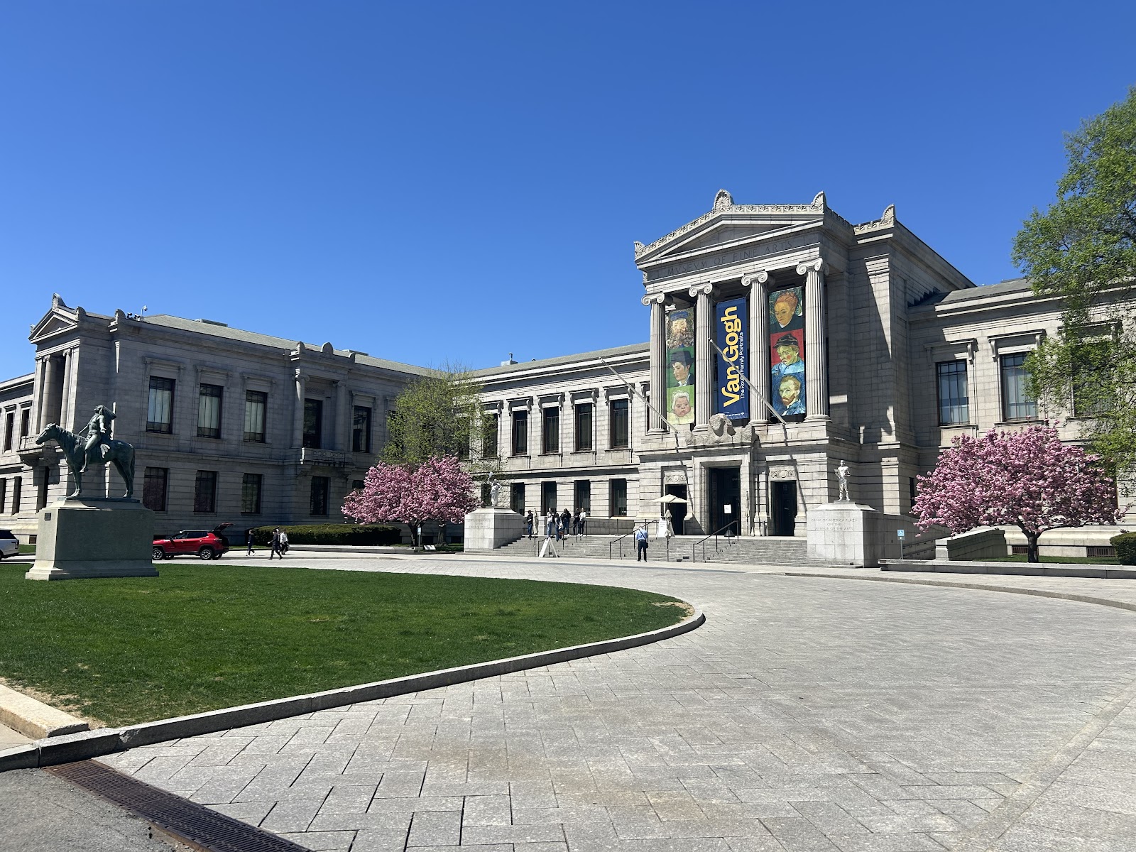
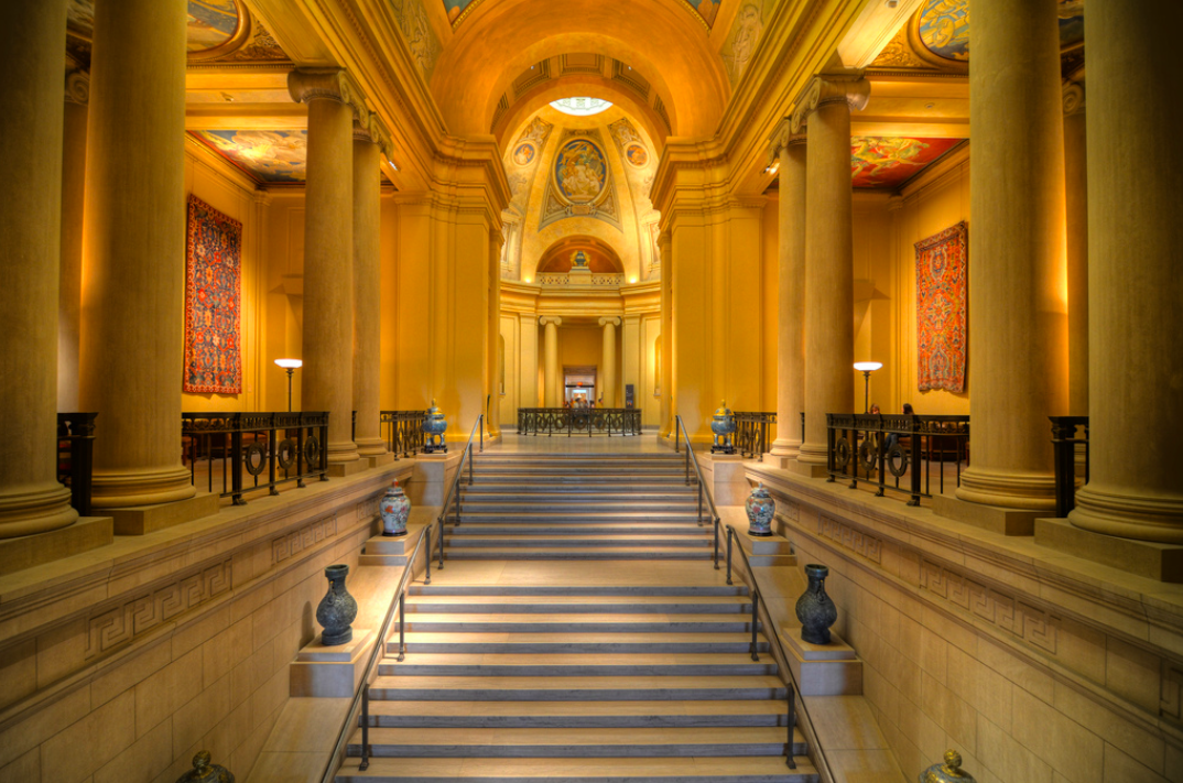
The Museum of Fine Arts, by its own description, awes visitors with a majestic atrium and sweeping grand staircases — which is precisely the right emphasis, because those are the spaces that photograph best.
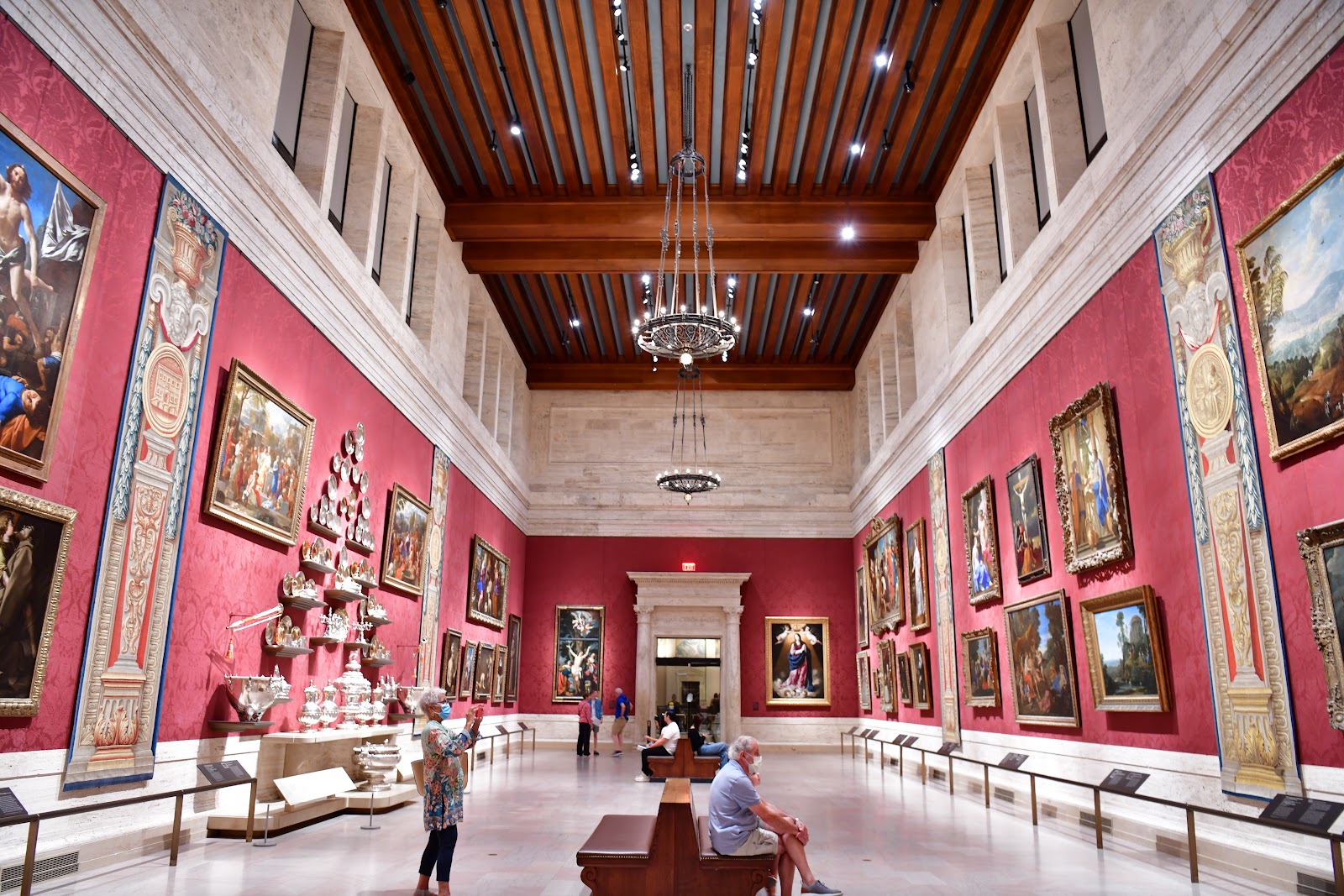
A major art museum inverts the usual relationship between the interesting rooms and the workable ones. Galleries hold the collection and are lit for it: conservation caps the light level, display fittings aim it down at objects, and the fittings themselves are often narrow-spectrum. Public architecture — atria, halls, staircases, circulation — holds nothing light-sensitive, so it is generously lit, and in a building of this ambition it is also monumental. The best-lit rooms are the ones nobody comes to see.
This is written as the problem and four ways out of it. We have not photographed a wedding at the MFA; conservation lighting behaves the same in every museum. Whether photography is permitted in galleries, whether stands and flash are allowed, and which spaces a booking includes are the first questions, and the answers improve the plan rather than shrinking it.
The Museum of Fine Arts at a glance
| Where | Boston, Massachusetts |
| Character | A major art museum with a monumental atrium and grand staircases |
| The asset | The public architecture, which has no conservation limit |
| The obstacle | Gallery lighting: low level, hard pools, from directly above |
| Ask first | Gallery photography, stands and flash, which spaces are included |
Why gallery light fails a face
The instinct is to treat gallery light as simply dim and to solve it with ISO, and level is only one of three problems — the least serious of them.
Direction is the second. Display lighting comes from track or recessed fittings in the ceiling, aimed down at objects on walls and in cases. Light from directly above puts the eye sockets in shadow, draws a hard line down from the nose and leaves the underside of the chin dark, which is the lighting direction used deliberately in horror films for exactly that reason.
Spectrum is the third and it survives editing least well. Museum fittings are frequently narrow-band LED chosen for low ultraviolet output and long life rather than for colour rendering. Under a low-CRI source skin can go sallow or plum-toned even at technically correct white balance, because the source is not emitting the wavelengths skin needs to reflect — and no slider recovers a wavelength that was never there.
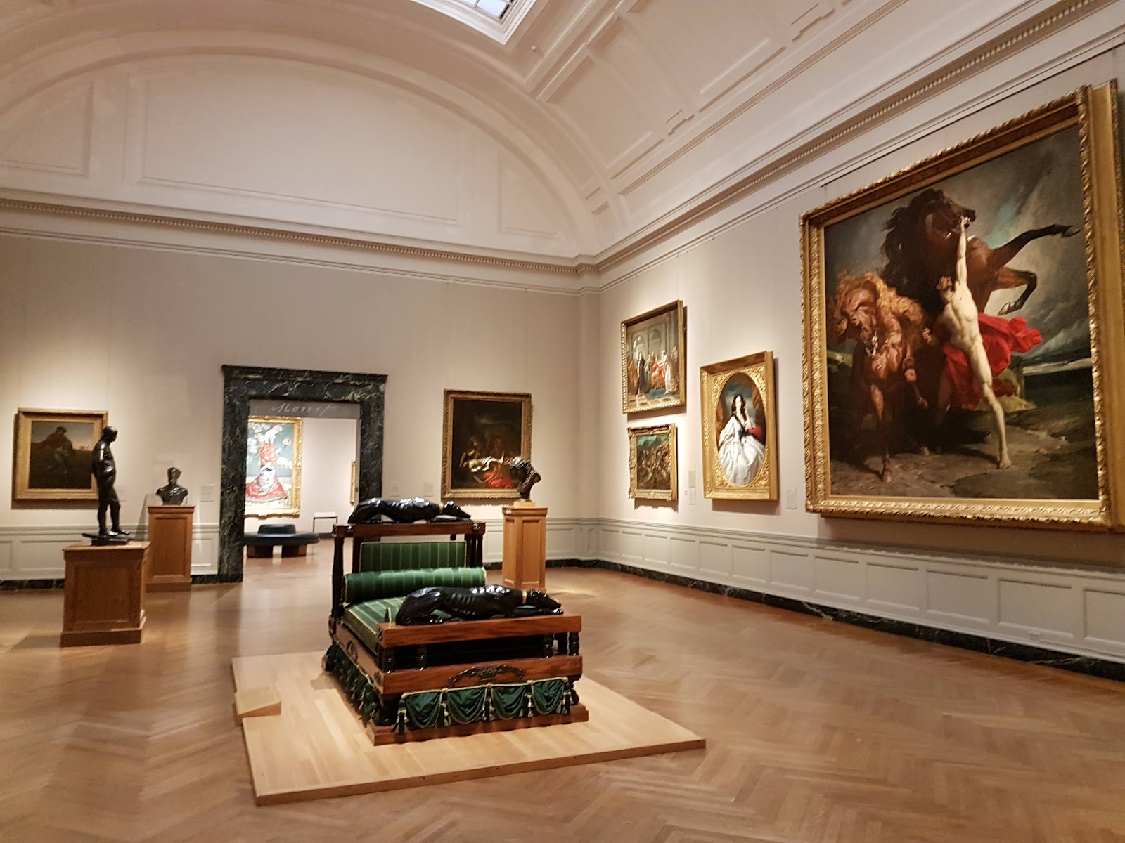
Galleries in a museum of this scale often have mid-tone or dark walls with high ceilings, so bounce returns nothing and every source has to be direct and modified.
There is also a permissions layer that a hotel does not have, and at a major collection it is more extensive than most people expect. Works may be on loan with conditions attached; reproduction rights may be restricted; particular rooms may prohibit photography entirely. Whether photography is allowed, whether stands are allowed, and whether flash is allowed are three separate questions and venues frequently answer them differently — so all three belong in writing.
Large saturated works add a further colour problem: a big canvas throws its own hue across a nearby face, and because that cast is localised, global white balance cannot separate it from the subject.
Four ways out
The first way out is the atrium, and at this museum it is the strongest answer rather than a consolation. A monumental atrium holds nothing light-sensitive, so it is generously lit; it is tall and usually symmetrical, so a composition is ready-made; and it is finished in pale stone, which reflects and raises ambient across the whole space. The result is soft even light at a usable level, the same everywhere, which makes groups easy and position almost unimportant.
Two adjustments come with it. The light arrives largely from above, so eye sockets darken and a line marks under the nose — fixed with a reflector held low, a lifted chin, or a small face-height source. And pale stone pushes a meter towards underexposure, so add a stop or more exactly as for snow, checking the stone still holds texture rather than clipping to blank cream.
The second way out is the staircases, and a sweeping stair is the single most useful feature in a museum of this type. It gives elevation, a diagonal or a curve, a handrail as a leading line, and rows for a group automatically, which a flat gallery floor never provides. Almost every group photograph in a building like this belongs on its stairs — and the frame is stronger than any gallery could offer.
The third way out is to use display light deliberately rather than fighting it. A hard narrow beam from above with the room dark around it is a dramatic light, and if a subject is placed exactly where a pool falls and the camera is stopped down for the ambient, the result is a figure emerging from darkness. That is a real frame rather than a compromise — but only if it is chosen rather than accepted.
The fourth way out is to bring one small source and treat the gallery as background. One light, off-camera, at face height, gridded or modified so nothing spills onto works, cases or walls, gelled to sit near the gallery colour, at about a stop under a correct reading for the room. That gives a face that reads with a gallery that still looks like a gallery. The error is overpowering: a brightly lit couple against a black void is a studio portrait with a museum in the caption.
Artworks behind people always need the same decision — commit to one work deliberately so both read, or subordinate everything with a long lens at a wide aperture so the wall becomes a soft field of colour. Half-in fails.
- Shoot the atrium: even light at a usable level, and nothing to carry
- Add a stop or more in pale stone, and fix overhead light with a low reflector
- Put the group on the sweeping stairs; a gallery floor makes no rows
- Use a display pool on purpose, stopped down, room going dark
- One gridded source, a stop under the room, spilling onto nothing
Working the day, outside, and Boston weather
The running order at a museum is simple because nothing indoors changes through the day. Interior coverage can be scheduled wherever it is convenient, which means the outdoor block belongs in the last ninety minutes and everything else arranges itself around protecting it.
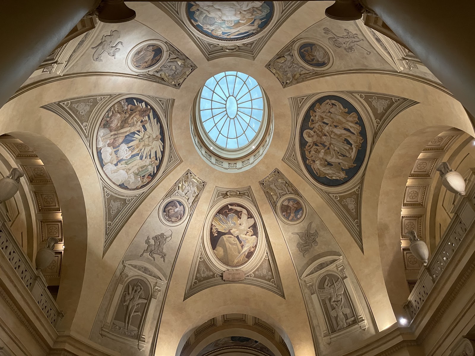
Detail work is worth building in deliberately rather than treating as filler. Carved stone, joinery, brass, worn steps and architectural ornament are subjects in their own right, photograph well on a fast lens at a raised ISO by whatever light is there, and establish the character of the building more convincingly than a wide frame does. They need no permissions and no setup.
Symmetry demands precision here because the architecture is built on it. A frame down an axis or centred on a symmetrical elevation collapses if the camera is slightly off centre or a degree out of level — the near-miss is the only failure available, since a clearly off-axis frame reads as intentional. Use the electronic level and take the extra thirty seconds.
Outside, the material colour rule is worth carrying: brick and brownstone bounce warm and flatter skin, while granite and limestone bounce cool and can grey it. At a museum clad in pale stone that matters — the building’s own facade is a cool reflector, so a warm-gelled source or a warm reflector is worth having specifically.
Boston’s street plan is the other local fact. Outside Back Bay the streets are irregular rather than gridded, so which way a street runs relative to the setting sun is a block-by-block question rather than one answer for the city. A short walk with the sun’s position in mind is worth more than a map.
New England seasons differ sharply. Summer is humid but rarely extreme, and the long June days put sunset late enough that the golden hour arrives after a reception has started. Autumn brings the region’s foliage peaking in mid-October, which is a genuine asset: warm backlit colour that no other season provides, and a real complement to a cool stone building.
Winter is the hard one. Sunset falls in the middle of the afternoon in December, compressing the outdoor window into a couple of hours and making an early protected block essential. Snow is the compensation and it is the best natural fill there is, lifting exactly the shadows a low sun carves while fooling a meter by about two stops — and against pale stone it needs watching, because snow and limestone together will clip if the exposure is not checked.
One practical note about a large museum in this climate: the interior is heated and dry in winter and cooled in summer, so equipment carried in and out will fog in both directions. Let it come towards the temperature of where it is going before it gets there.
More frames from The Museum of Fine Arts
The Museum of Fine Arts wedding photography: common questions
Why is gallery light so difficult?
Three reasons, and level is the least. It comes from directly above, which darkens eyes and draws shadows down the face; and museum fittings are often narrow-spectrum, which renders skin sallow or plum even at correct white balance.
Can white balance fix the colour problem?
No. A low-CRI source is not emitting the wavelengths skin needs to reflect, and no slider recovers a wavelength that was never there. Your own gelled source on the faces is the fix.
Where is the best light in the building?
The atrium. It holds nothing light-sensitive so it is generously lit, and it is tall, symmetrical and pale-surfaced — soft even light at a usable level where position barely matters.
Where should group photographs happen?
On the sweeping staircases. Steps give elevation, a leading line and rows automatically, which a flat gallery floor never does, and the frame beats anything a gallery offers.
What has to be in writing beforehand?
Three separate things: whether photography is permitted in galleries, whether stands are permitted, and whether flash is permitted. Venues frequently answer those differently.
What should be watched in winter?
Snow against pale stone. Snow is the best natural fill there is and it fools a meter by about two stops, but snow and limestone together will clip if the exposure is not checked.
More Boston, MA venue guides
We are writing a photographer’s guide to every venue we would happily shoot in Boston, MA. Here are three more, plus the full index:
- The New England Aquarium, Boston: Four Ways Out of the Spiral Ramp Problem
- Old South Church, Boston: The One Decision That Governs Everything
- The Algonquin Club on Commonwealth Avenue: Questions Answered
All Boston, MA Wedding Venues →
Planning a wedding at The Museum of Fine Arts?
Three permissions in writing, then the atrium and the stairs. Tell us your date.