 The Hoxton Chicago: Photographing a Wedding in Fulton Market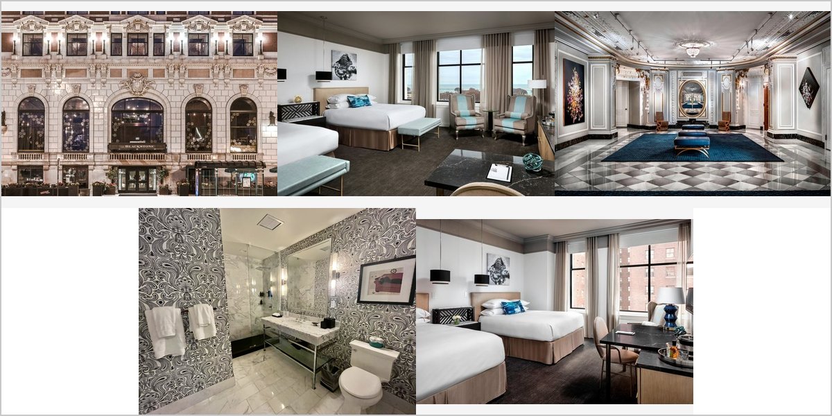
September 7, 2026
The Blackstone: Working a Building With Two Vocabularies
A period shell with a modern interior is two buildings in one address, and a set that mixes them badly looks like two weddings.
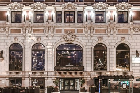
The Blackstone stands on South Michigan Avenue at Balbo, a Beaux-Arts hotel of 1910 with a substantial period presence — cornices, a grand stair, an ornate public room — that has been renovated over the years with contemporary furnishing, modern lighting and current guest rooms.
That combination is extremely common in American city hotels and it creates a specific photographic problem that almost nobody names. The building speaks two visual languages. There is the period vocabulary — plaster, symmetry, warm tungsten, gilding, pattern — and the contemporary one — clean lines, cool LED, restrained colour, plain surfaces. Each photographs well. A gallery that alternates between them without a governing decision looks like coverage of two different weddings.
So the logic of a venue like this is about coherence rather than about light. This is how to impose it. We have not photographed a wedding at the Blackstone; period shells with modern interiors behave the same everywhere. Which rooms are allocated, which of them are period and which renovated, are questions for their events team — and that is the single most useful question to ask.
The Blackstone at a glance
| Where | South Michigan Avenue at Balbo, Chicago, Illinois |
| Character | 1910 Beaux-Arts shell with contemporary renovated interiors |
| The problem | Two visual languages in one building, which do not blend |
| The fix | Pick one as the spine of the set; use the other as deliberate contrast |
| Nearby | Grant Park and the lakefront directly across Michigan Avenue |
Why mixed-era interiors fight each other
The incompatibility is mostly about colour temperature and contrast. Period rooms are lit warm — tungsten, or LED chosen to imitate it — and they are high in visual contrast because gilding, dark wood and deep colour create strong tonal separation. Contemporary renovated rooms are lit cooler and are low in contrast, because pale surfaces and even lighting flatten the tonal range deliberately.
Put a warm high-contrast frame next to a cool low-contrast one in the same sequence and both look wrong: the period frame reads as orange, the modern one reads as grey. It is not a fault in either photograph; it is the pairing. And because a wedding gallery is consumed as a sequence rather than as individual images, the pairing is what the couple actually sees.
Colour grading cannot fully reconcile them, and trying produces the familiar failure of a set where the period rooms have been cooled into lifelessness and the modern rooms warmed into a strange amber. The warmth of a period room is its character; the coolness of a modern one is its character. Removing both leaves nothing.
So the resolution has to be editorial rather than technical: decide which vocabulary is the spine of the set, shoot the majority of the coverage there, and use the other as a deliberate, sparing counterpoint. Ten frames in a period register with three clearly-different modern frames reads as intentional range. A fifty-fifty split reads as confusion.
Choosing the spine, and shooting to it
At a hotel like this the period rooms are usually the stronger choice, for a simple reason: they are what the building is, and they are what nowhere else has. A contemporary guest room in Chicago looks much like a contemporary guest room anywhere, whereas a 1910 Beaux-Arts public room does not. If the gallery is going to say where it was taken, the period spaces say it.
Having chosen, shoot to that register consistently. Warm the white balance deliberately rather than neutrally, so gilding stays gold. Gel your own lights warm so they belong in the room rather than punching a cold hole in it. Favour the higher-contrast rendering that suits the architecture, and light with direction rather than flatly — period rooms were built for point sources and they look right when shadow is allowed to exist.
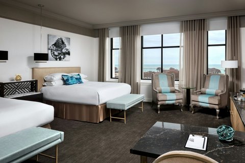
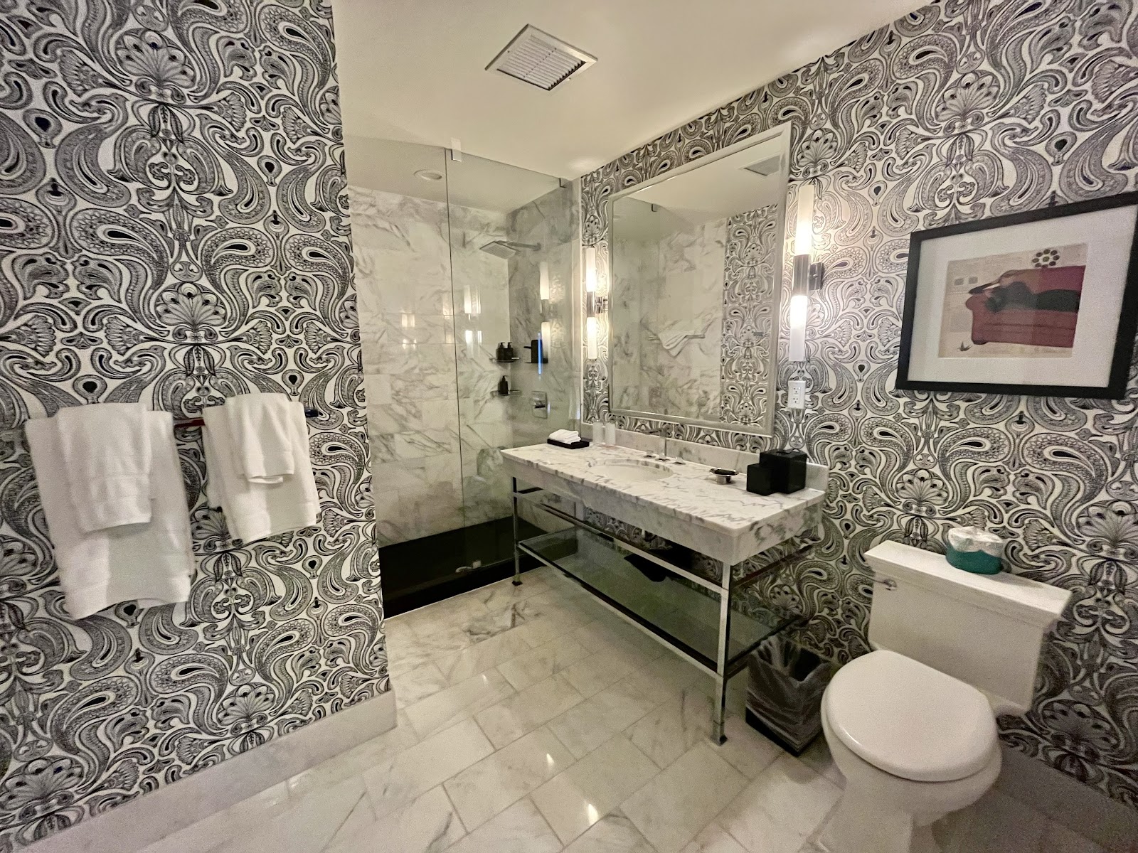
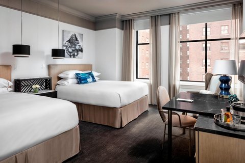
Then use the modern spaces for the things they genuinely do better. Preparation coverage is one: a renovated room with a large window and restrained furnishing is a far better place to photograph a dress, hair and makeup than a heavily patterned period room, because nothing competes and the light is clean. Detail photography is another. Those frames sit comfortably in a period-spined gallery precisely because they are clearly a different thing — close, bright, quiet — rather than a half-tone variation.
A practical instruction that helps enormously: shoot the two registers at different times rather than interleaved. Preparation in the modern rooms in the morning, everything else in the period spaces later. That way the sequence has a natural structure and the contrast lands where the day changes anyway.
The grand stair, the public room and the Michigan Avenue side
The grand stair is the reliable set piece for the usual reason: it arranges people at different heights automatically, which is what makes large groups work and what makes a couple read as two separate figures rather than one mass. One step apart, and the composition resolves itself.
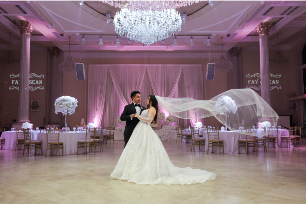
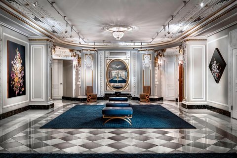
An ornate public room is a dynamic range exercise before it is anything else. Uplit plasterwork and chandeliers sit several stops above the people standing beneath them, so the working method is the one all grand interiors demand: light the couple up towards the architecture rather than exposing down to them, so the ceiling keeps its detail and the faces still read. Expect the chandeliers to clip and make sure they clip small and cleanly rather than blooming.
Outside, the South Michigan Avenue position is genuinely useful. Grant Park is directly across the road, which gives open lawns, mature trees, fountains and a lakefront beyond, all within a couple of minutes on foot — daylight, neutral colour and space, immediately available without a transfer. The park is at its best in the last ninety minutes and is public and busy throughout, so the usual method applies: long lenses, tight framing, decisive blocks.
The facade itself is worth one frame from across the street. A 1910 Beaux-Arts elevation photographed from the far pavement with a long lens, compressing out the traffic, gives the gallery an establishing image that locates the whole day — and an establishing frame is something most wedding sets lack and benefit from.
What works in your favour
- A genuine 1910 Beaux-Arts period register that modern hotels cannot fake
- A grand stair that solves group composition without direction
- Renovated rooms that are ideal for preparation and detail coverage
- Grant Park and the lakefront directly across Michigan Avenue
- Two registers available deliberately, if one is chosen as the spine
What to plan around
- Period and contemporary frames clash in colour and contrast when interleaved
- Grading cannot reconcile them; attempting it flattens both
- Ornate public rooms run several stops brighter overhead than at floor level
- Chandeliers will clip, and bloom if the exposure is undisciplined
- Grant Park is public and busy in every season
More frames from The Blackstone
The Blackstone wedding photography: common questions
Why does my gallery look inconsistent at a renovated period hotel?
Because the building speaks two visual languages. Period rooms are warm and high contrast; renovated rooms are cool and low contrast. Neither photograph is wrong, but placing them next to each other in a sequence makes the first look orange and the second look grey.
Can colour grading fix it?
Not really. Cooling the period rooms drains their character and warming the modern rooms makes them look odd — the warmth and the coolness are what each space is. The fix is editorial: choose one register as the spine of the set and use the other sparingly as contrast.
Which register should lead?
Usually the period one, because it is what the building is and what nowhere else has. A contemporary guest room in Chicago looks like a contemporary guest room anywhere; a 1910 Beaux-Arts public room does not. If the gallery should say where it was, the period rooms say it.
What are the modern rooms best for?
Preparation and detail coverage. A renovated room with a large window and restrained furnishing is a far better place to photograph a dress or hair and makeup than a heavily patterned period room, because nothing competes and the light is clean.
Is there a simple way to keep the set coherent?
Shoot the two registers at different times rather than interleaved — preparation in the modern rooms in the morning, everything else in the period spaces afterwards. The contrast then lands where the day naturally changes, and the sequence gains structure.
How do you handle the ornate public room?
Light the couple up towards the architecture rather than exposing down to them, so the plasterwork keeps detail and faces still read. Expect the chandeliers to clip; keep the exposure disciplined so they clip small and cleanly instead of blooming.
More Chicago, IL venue guides
We are writing a photographer’s guide to every venue we would happily shoot in Chicago, IL. Here are three more, plus the full index:
- The Drake Hotel: A Grand Ballroom and a Lake Michigan Window
- The Godfrey Chicago: What a Retractable Roof Actually Changes
- The Gwen: How the Carved Relief Frame Is Actually Made
All Chicago, IL Wedding Venues →
Planning a wedding at The Blackstone?
A two-language building needs one editorial decision made early. Tell us your date and which rooms you have, and we will pick the spine.