 The Memphis Zoo: The Problem, and Four Ways Out of It
The W Nashville: One Frame, and How It Is Made
Two small figures, one hard light, and the building’s own colour at full strength.
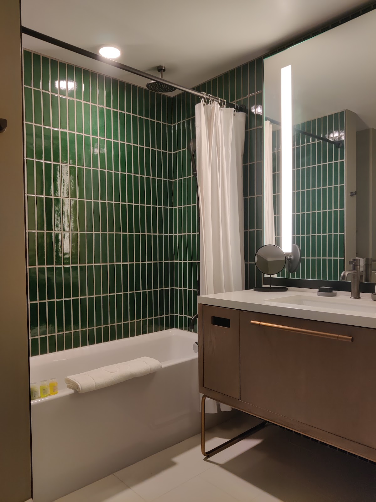
This guide is about a single photograph, and it is a photograph you can only make in a building that has committed to colour.
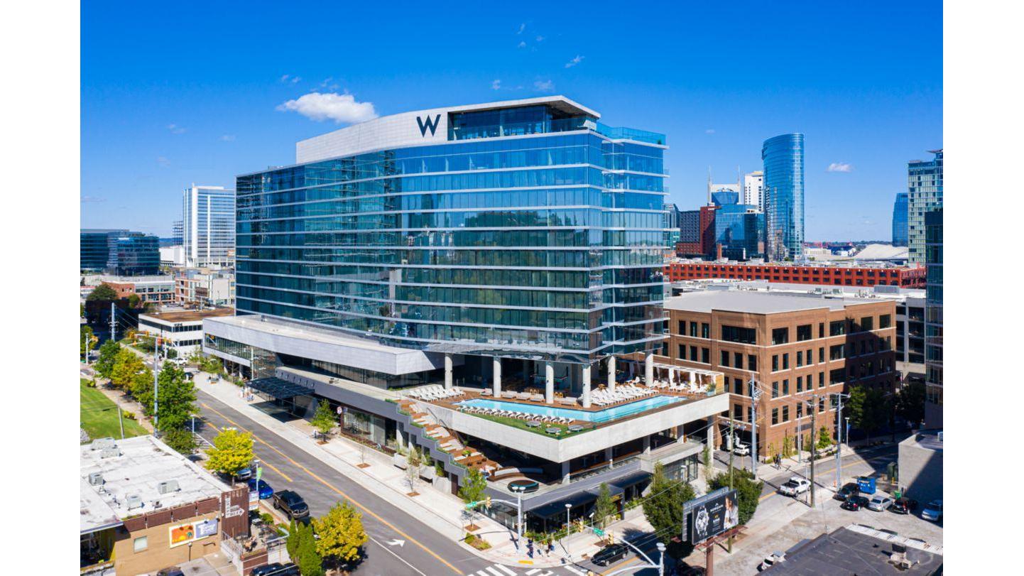
The W Nashville opened in 2021 in the Gulch, running to something in the region of fifteen storeys, and it does what the brand does: a designed interior rather than a decorated one, a lounge in place of a conventional lobby, a pool deck, and a graphic language that runs consistently through every room instead of stopping at the lifts.
A photographer’s instinct in a building like that is to look for the neutral corners, because neutral is safe. That instinct is wrong here, and following it produces a set of photographs that could have been made in any hotel in the country.
The frame worth building is the opposite. Find one large field of the building’s own saturated colour — a wall, a panel, an installation, a stair enclosure, whatever the designers have committed to most fully. Put two figures in it, small, at one end or one side rather than the middle. Light only the figures, with one hard source. Expose so the colour is at full strength and the two people are the only neutral thing in the picture.
What that produces is an image where the venue is genuinely the subject and the couple are genuinely the point, at the same time, which is an unusual combination. Most venue photographs are one or the other: a room with people in it, or people with a room behind them. This is neither.
It works because of a specific piece of physics. A saturated colour field lit by ambient sits at some value, and a face lit by a separate hard source can be put at any value you choose relative to it. Once the two exposures are independent, the colour can be taken to full saturation without the skin going with it — and full saturation is where designed colour finally looks the way the designer intended rather than the way a camera averages it.
The reason the figures must be small is scale. A field of colour that fills the frame with two heads in it is a portrait against a coloured wall, which is an ordinary thing. The same field with two small figures in the corner of it is a photograph about a place, and the people in it read as having arrived somewhere rather than as having posed somewhere.
And the reason there is one light rather than two is that two lights make the subject look lit, which breaks the illusion that they are simply standing in the building. One hard source from a shallow angle reads as a found condition even when it is not.
What follows is how to build it in practice, then what else the building gives you around it, then what Nashville does to the day.
The W Nashville at a glance
| Where | A design-led hotel in the Gulch, Nashville; opened 2021 |
| The frame | Two small figures in one large field of the building’s own colour |
| The method | Expose the colour to full saturation, light only the people, one source |
| Why it works | Two independent exposures, so skin and colour separate |
| Ask first | Which spaces are available and when; whether lights on stands are permitted |
Building the frame
Start by finding the field, and be fussy about it, because most coloured walls are not fields.
What you want is a continuous area of one colour large enough that you can fill the frame with it and still have the subject occupy a small fraction. If the wall’s edge is visible, or the skirting is a different colour, or there is a light switch in it, it reads as a wall rather than as a field, and the whole effect collapses into an ordinary background. Walk the building specifically looking for continuity, and be prepared for the answer to be one location rather than five.
Vertical extent is usually the limiting factor. A field that runs floor to ceiling is ideal because you can then include the floor and still have an unbroken plane behind. A field that stops at head height gives you a band, which is a different and lesser picture.
Second: measure the ambient on the field and decide what you want it to be. This is the decision that makes the frame, and the instinct to expose it correctly is the wrong instinct. A saturated colour rendered at a correct middle exposure looks pale, because saturation reads highest when a colour is slightly underexposed. Take it down by half to a full stop from where the meter puts it and the colour deepens and gains body. Take it down two stops and it goes murky. Somewhere between two thirds and one stop under is where designed colour looks like itself.
Third: light the people, and light them so they are separable from the colour. This is where the frame is won or lost.
The problem is that a large lit coloured surface is a coloured light source. Everything within a few metres of it is receiving its colour, and skin in particular picks it up in a way that is immediately obvious and entirely uncorrectable in post, because the cast is genuinely on the face rather than in the file. So distance from the field is the first control: three or four metres if the room allows it. If the room does not allow it, the field has to be in shade or at lower ambient so it is not throwing much.
Then one hard source. A small unmodified head, or a bare bulb, or a modifier no larger than about sixty centimetres, placed off to one side at about forty-five degrees and slightly above, close enough to be efficient. Hard light has a defined edge and it falls off fast, which is precisely what you want: the subject is lit, the field a metre behind them is not measurably brighter, and the two exposures stay independent.
Warm that source very slightly. Skin lit by a bare neutral flash in a room full of strong colour reads as clinical, and a light warming gel closes the gap between your light and the building’s own scheme so the subject looks like they belong in the room rather than having been inserted into it.
Fourth: the lens. Wide enough to include the whole field, which usually means something in the twenty-four to thirty-five range, and stopped down enough that the field is genuinely flat and sharp rather than softly graded — f/5.6 or f/8. This is the opposite of the long-and-open approach that works in cluttered venues. Here the background is the point, so it must be rendered properly.
Fifth: the geometry. Square on to the field, dead parallel, so the plane reads as a plane. Any convergence in the verticals turns a field into a wall in perspective and the graphic quality goes. Check the verticals in the viewfinder rather than trusting the level, and put the subject well off centre, at the third or nearer the edge, so the emptiness of the rest is deliberate.
Sixth, and most important: tell the couple what you are doing. A photograph in which they are two centimetres tall is not what anyone expects when they stand up against a wall, and unbriefed people will walk toward the camera to fill the frame because that is what everyone does. Explain the picture, put a marker on the floor, and make three or four exposures with small changes in their posture rather than in the camera position.
Total time to make this, once the position is chosen: about six minutes. Time to find the position: half an hour on a scout, or ten minutes and some luck on the day. Do it on a scout.
One final variant worth having in the bag. The same construction with the subject in silhouette — no light on them at all, just the field at full ambient and two dark shapes in it — is a stronger picture in some rooms and takes twenty seconds. Make both. The silhouette version works when the field is bright and the subject’s outline is clean; it fails the moment their shapes merge, so it needs air between them.
What else the building gives
The colour field is the frame worth planning for. The rest of the building is straightforward and it has four assets.
The first is that a design-led interior is consistent, which for a photographer means a set that hangs together without effort. A hotel that has committed to one palette will hand you thirty frames in different rooms that all look related, and relatedness is most of what makes a wedding set feel considered. That is worth more than any individual room.
The second is the lounge that stands in for a lobby. Those spaces are designed as social rooms rather than as circulation, which means seating in arrangements, layered lighting at low levels, and interesting objects at eye height. They photograph as places where something is happening even when nothing is, and they are the best space in the building for candid coverage during drinks.
They are also dark. Designed hospitality lighting sits well below what a camera wants, and it comes from above, so eye sockets go heavy. A pale ceiling at a normal height will take a bounced light beautifully; check the ceiling colour first, because a deliberately dark ceiling is a design choice in buildings like this and it will eat everything you send at it. If the ceiling is dark, you are on a small modifier and direct fill instead.
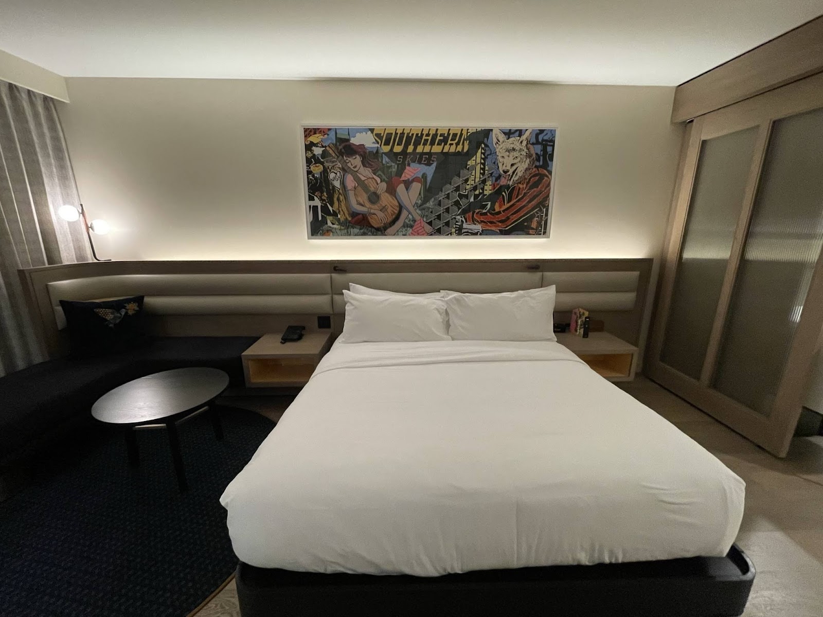
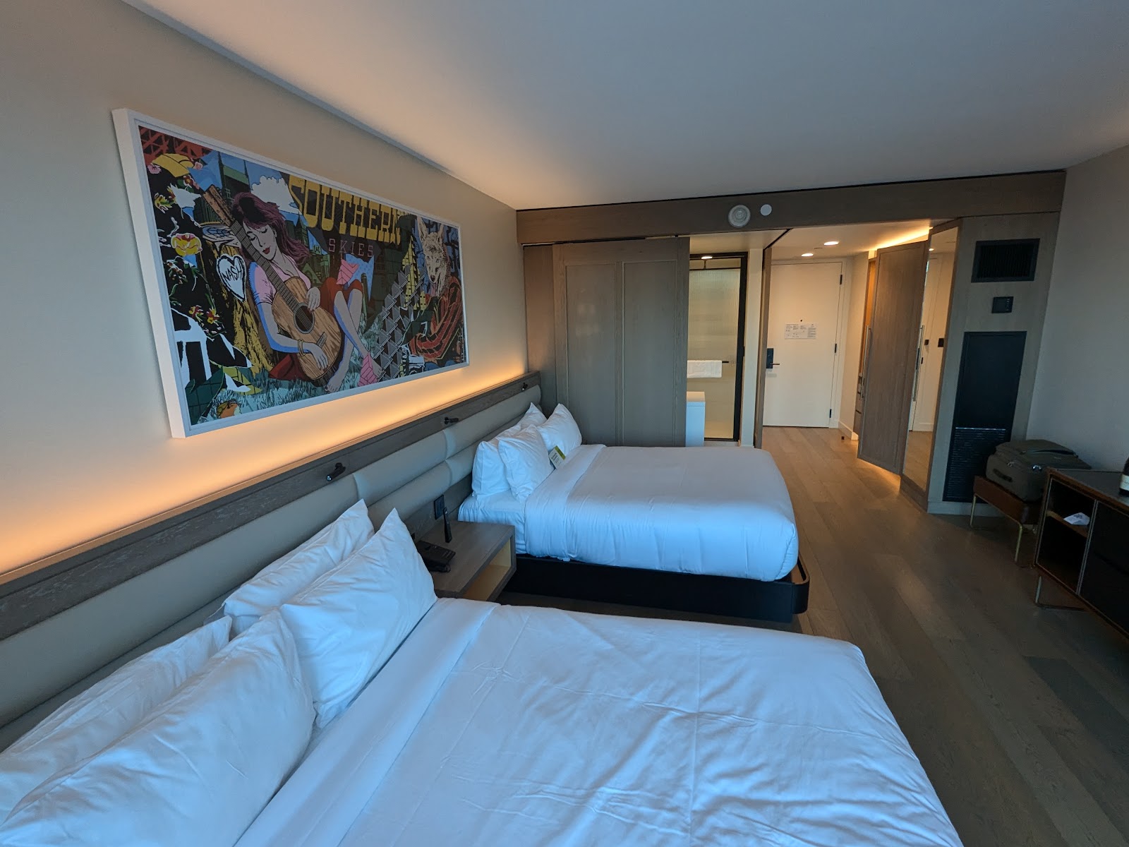
The third asset is the guest rooms, which in new construction come with large windows, pale or at least controllable walls, and no immovable clutter. Strip the room, side-light from the window at a metre and a half, and it is as good a preparation space as any in the city. At fifteen storeys in a low district the windows see a lot of open sky and comparatively little wall, so the light is even and slightly cool.
Cool is worth noting rather than fighting. Modern glazing is coated to reject heat and the coatings shift transmitted daylight cooler and often slightly green. That happens in every contemporary building and it is why interiors photographed on window light in new hotels look bluer than the eye remembers. Warm the whole block consistently rather than frame by frame.
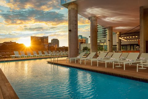
The fourth asset is the pool deck, if the booking includes it. An open deck at height is a different kind of light entirely — real sky, real ambient, no glazing cast, a genuine horizon — and water on a deck is a reflector that bounces up into faces from below, which is the one direction the rest of the building never gives you. Two cautions: wind at height is faster than at street level and makes both veils and lightstands a problem, and a pool deck is usually a shared amenity with its own guests, so what a wedding actually gets there is a commercial question to settle in writing.
What the building does not give you is period detail, patina, or material with age in it. Every surface is nine years old or less. If a couple wants a photograph that looks historic, this is not the building for it and no amount of technique will produce one. Say that plainly at the enquiry stage. What it will produce is a set that looks deliberately of its moment, which is a real aesthetic rather than a consolation.
Two logistical things to confirm before the day. Whether lights on stands are permitted in the public spaces and at which hours — design-led hotels are often protective of their lounges during service, entirely reasonably, and the answer shapes your whole plan. And which of the event spaces you actually have, because the difference between a room with exterior glazing and a windowless one is the difference between two completely different photographic days.
Ask both in the same email. The answers take a week to arrive and they are worth having in February rather than on the morning.
Nashville, and the year
Nashville sits in the Nashville Basin, which is the eroded core of an ancient dome: the rock arched up, the crown wore away, and what remains is a shallow bowl of grey Ordovician limestone with the Highland Rim standing a few hundred feet above it at a distance.
Three consequences follow and all three are visible in photographs.
The city is flat, with no useful natural elevation change and no high ground close in, so separation between subject and background has to come from optics or from lighting rather than from topography. That is part of why an interior frame like the one above earns its place here.
The soil over the limestone is thin, which limits how large street trees get, and in a recently redeveloped district like the Gulch there is almost no mature canopy at all. So outdoors here means brick, glass, concrete and asphalt with nothing overhead, and there is no shade to retreat into between about noon and half past two in summer, when the sun at this latitude reaches near seventy-seven degrees. Plan that block indoors.
And the local stone is cool. Nashville limestone is a hard blue-grey with visible fossil content — crinoid stems, shell fragments, laid down as a tropical sea floor — and it photographs cold, going genuinely blue in shade. It warms well but it has to be warmed deliberately or older Nashville buildings will look lifeless beside the same frames made elsewhere.
The latitude, about thirty-six degrees north, gives about twenty-six minutes of civil twilight in midsummer and slightly less around the equinoxes. The genuinely useful part, where the exterior sky and the interior lighting are within a stop of each other, runs ten to twelve minutes. At a venue whose best frame is indoors and independent of the sun that matters less than at most places, which is a quiet advantage: the colour-field frame can be made at two in the afternoon or at eleven at night with identical results.
Humidity does what it does across the whole region. July dewpoints in the low seventies fill shadows by something like two stops against a dry climate, so outdoor midday shade is workable, at the cost of a pale washed sky and haze on long lenses. It also fogs a lens within seconds when a camera comes from air conditioning into summer air — a repeated problem on any day that alternates between the two. Keep the body warm rather than cool.
Season by season, and for this venue the emphasis is on schedule risk rather than on light, because the light here is mostly yours to make.
October into early November is the best window: dry air, comfortable temperatures, sunset around six, and a clear sky that finally lets any exterior frame resolve properly. It is also the most heavily booked.
April into May is beautiful and it carries the year’s real hazard. Middle Tennessee sits in an active spring severe-weather corridor and the systems that arrive are organised and fast — not a passing shower but a front with genuine wind. For an interior-led venue that is mostly an inconvenience rather than a disaster, which is a real advantage of choosing a building like this, but it does mean any outdoor or pool-deck element needs a substitute rather than an optimism.
Summer is pleasant indoors and hard outside: low nineties with a low-seventies dewpoint and no shade in the district. The compensation is the long evening, with sunset after eight, so a late reception still has usable daylight at the start of it. Afternoon storms are frequent and quick, and the half hour after one clears is the best exterior light of the year here — washed air, wet asphalt reflecting the sky, saturated colour everywhere, and a low sun under a broken ceiling.
Winter is the short season and it has one hazard worth naming, because Nashville sits further north than Memphis and right on the boundary between winter rain and winter ice. Middle Tennessee gets occasional freezing rain, and an ice event is a travel problem rather than a photographic one: it closes roads, grounds flights and strands suppliers. It is uncommon in any given January, but a winter date here should have a contingency that assumes nobody can drive, in a way a Memphis date need not to the same degree.
Against that, winter light is the best of the year in quality: a noon sun near thirty degrees models faces all afternoon, the air is completely clear, and the city reads sharpest of all in cold. And sunset before half past four means the dusk block falls during cocktails, which needs putting on the timeline rather than discovering.
None of which changes the frame. That is the point of it — it is a photograph made entirely out of the building, one light and a decision, and it is there in any weather, at any hour, in any month.
More frames from The W Nashville
The W Nashville wedding photography: common questions
What is the one frame?
Two figures, small, in one large continuous field of the building’s own saturated colour, lit by a single hard source while the colour is exposed at full strength. The people are the only neutral thing in the picture. It makes the venue the subject and the couple the point at the same time, which most venue photographs cannot do.
Why underexpose the colour?
Because saturation reads highest slightly under a correct middle exposure. A designed colour metered correctly looks pale and washed; taken down two thirds to one full stop it gains depth and body and starts to look the way the designer intended. Two stops under and it goes murky, so the range is narrow.
Why only one light?
Two lights make a subject look lit, which breaks the illusion that they are simply standing in the building. One hard source from about forty-five degrees and slightly above reads as a found condition, falls off fast enough to keep the subject’s exposure independent of the background’s, and takes twenty seconds to set up. Warm it very slightly so the skin sits in the same world as the room.
Won't the coloured wall cast onto their skin?
Yes, if they stand near it, and that cast is genuinely on the face rather than in the file, so no white balance removes it. Distance is the control — three or four metres from the field if the room allows. If it does not, the field has to be at lower ambient or in shade so it is not throwing much light of its own.
Is this a good venue for a historic or timeless look?
No, and it is better to say so at the enquiry stage. Every surface in the building is less than a decade old, there is no patina and no period detail, and no technique produces age that is not there. What it produces instead is a set that looks deliberately of its moment and hangs together completely, because the palette is consistent from the lounge to the lifts. That is a real aesthetic rather than a consolation.
Does the weather matter here?
Less than at most venues, which is one of the reasons to choose it. The frame above is independent of the sun and can be made at any hour in any month with identical results. What weather affects is the outdoor and pool-deck elements, and there the risks are spring severe storms — organised and fast rather than passing — and, in winter, occasional Middle Tennessee freezing rain, which is a travel problem for guests and suppliers more than a photographic one.
More Nashville, TN venue guides
We are writing a photographer’s guide to every venue we would happily shoot in Nashville, TN. Here are three more, plus the full index:
- Cheekwood Estate & Gardens, Nashville: A Walk Down the Terraces
- The Four Seasons Nashville: The Light Through the Day
- The Graduate Nashville: Field Notes, Problem and Solution
Planning a wedding at The W Nashville?
One field, one light, six minutes. Tell us your date and we will find the field first.