 The Van Dusen Mansion, Minneapolis: A Walk Through House and Grounds
The Ivy Hotel, Minneapolis: The One Decision That Governs Everything
Classic character and contemporary design in one building is two eras, and a sequence can only carry one.
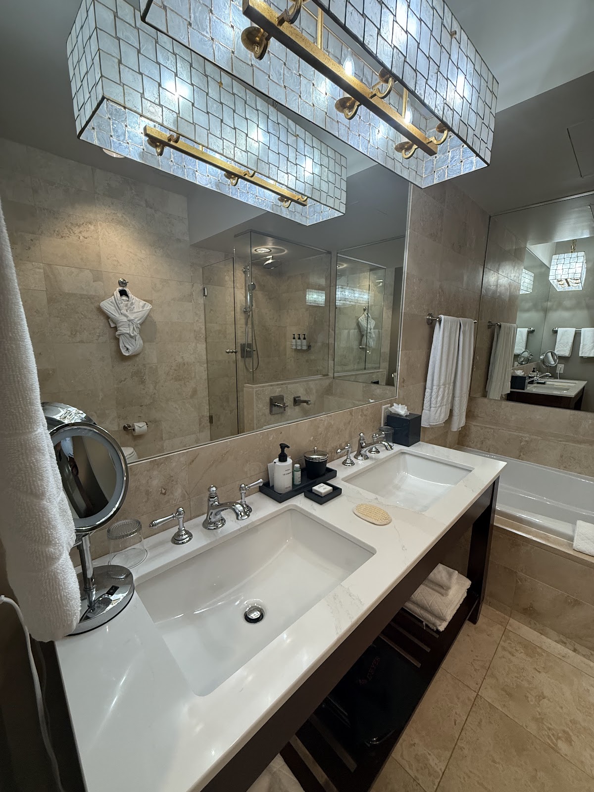
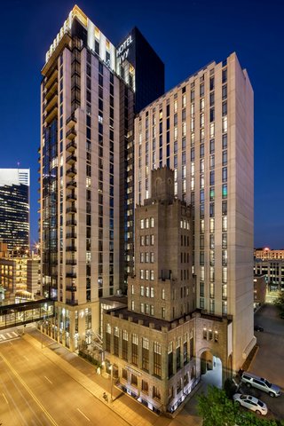
The Ivy Hotel is housed in a historic building and blends classic charm with contemporary design, as its own description has it.
That blend is the venue’s defining feature and it contains the one decision that governs every frame. Two eras in one building are not a range to draw on but a choice to make, because they are photographically incompatible in a sequence. A historic interior is lit warm and is high in contrast, since ornament, stone and darker materials create strong tonal separation. A contemporary interior is lit cooler and is low in contrast, because pale surfaces under even light produce almost none.
Place a warm high-contrast frame next to a cool low-contrast one and both look wrong: the historic one reads as orange, the modern one as grey. Neither photograph is at fault; the pairing is. And a wedding gallery is consumed as a sequence rather than as single images, which makes the pairing the thing that matters.
Grading cannot reconcile them either, because the warmth of one and the coolness of the other are what each thing actually is — remove both and nothing is left. So the decision is a spine, made before the day: which era leads, with the other used where it is genuinely better and split by time rather than interleaved.
We have not photographed a wedding at the Ivy; hotels blending a historic shell with contemporary design behave consistently. Which spaces are included, which of them are historic and which are new, and whether the function room lighting is adjustable are the questions for their team.
The Ivy Hotel at a glance
| Where | Minneapolis, Minnesota |
| Character | A hotel in a historic building with contemporary interior design |
| The decision | Which era leads; the other is used where it is genuinely better |
| Why | Warm high-contrast and cool low-contrast frames make each other look wrong |
| Ask first | Which spaces are historic and which are new; lighting control |
Choosing the spine
The historic era is usually the stronger choice for one reason: it is what nowhere else has. A contemporary hotel interior in Minneapolis looks much like a contemporary hotel interior anywhere, whereas a specific historic building does not — so if the gallery is going to say where it was taken, the older material has to lead.
That is not automatic, though, and there are briefs where the modern half is the right spine: couples whose references are pale, bright and airy will get that in the contemporary spaces and cannot get it in the historic ones, and pretending otherwise produces a day of quiet compromise. The decision belongs to the couple’s references rather than to the photographer’s preference, and it should be made explicitly.
Whichever leads, the other still earns its place. If the historic material is the spine, the contemporary spaces are where preparation, dress and detail work belong — they have cleaner backgrounds and more even light, which is exactly what detail work wants. If the contemporary material is the spine, the historic spaces supply two or three deliberate frames rather than a parallel set.
And the split should be by time rather than by frame. Preparation in one register in the morning, everything else in the other, so the change lands where the day naturally changes rather than in the middle of a sequence. Alternating frame by frame is what produces a gallery that looks inconsistent no matter how good each picture is.
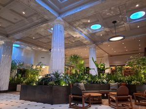
One practical note on identifying which is which: in a converted historic building the older material is usually concentrated at the base and in the structure — a lobby, an entrance, a stair, exposed masonry or timber — while the contemporary work is in the rooms and the fit-out. Walking the building once and noting which spaces belong to which era is the most useful ten minutes of preparation, and it is not always obvious from photographs.
What each era needs
Historic material is light-hungry and warm. Timber, masonry, deep colour and patterned textiles absorb rather than return light, and usable room light is mostly bounced — so a historic space is two stops or more below a pale contemporary one with identical windows, and bounce flash returns a fraction of what it would elsewhere. Test it with one frame on arrival; where it fails, a pale wall at a sensible distance is the better surface and direct modified light better than either.
It also needs raking light to be itself. Masonry, timber and plaster relief read only when light crosses them at an angle and cast small shadows — along a surface they show texture, at it they flatten to a brown or pale field. One source placed to graze rather than face is the whole technique, and it is a one-light problem rather than a big-kit one.
Warm bounce is the colour condition: timber, brass and warm paint reflect strongly warm, and the cast arrives on the shadow side of a face from several directions. Bounced and localised, so global white balance cannot separate it — let one gelled source be the authority on faces and let the material be as warm as it is.
The compensation is steep fall-off, which is free separation: in a warm dim historic room a subject three metres in front of anything else sits against natural darkness.
Contemporary material is the opposite on every point. Pale surfaces reflect, so the ambient is higher and the room fills its own shadows — which produces flat faces and no separation between a subject and a background. One directional source at close to ambient level restores shape; and negative fill, something dark on the shadow side of a face, restores the gradient more cheaply than adding another light.
Separation comes from depth, a wide aperture, and placement against the darkest element available. And pale ceilings mean bounce actually works, which is worth testing because it is the reverse of the historic half of the building.
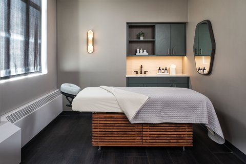
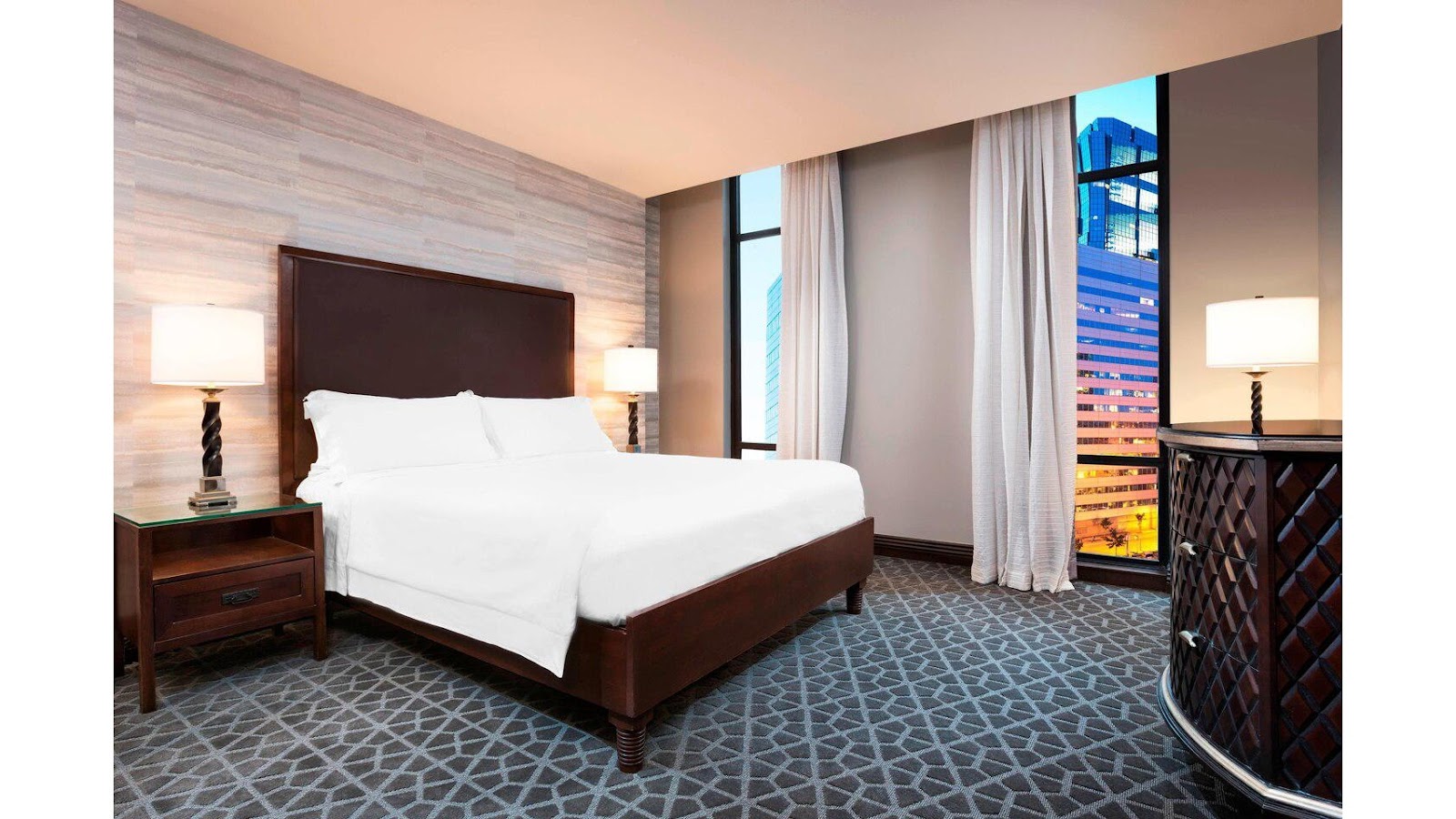
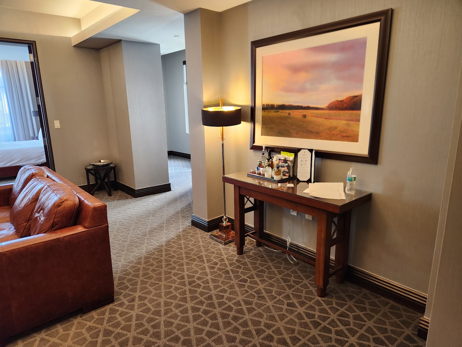
Guest rooms, whichever era they belong to, remain the best portrait light available: domestic-sized windows with close walls that bounce and ceilings low enough that a flash aimed upward returns something. Largest window on the shaded side, every overhead fitting off, lamps out of frame — and in a historic building the windows may be taller than modern ones, which sends light further into the room.
- Choose the spine from the couple’s references, not from preference
- Split by time, not by frame; alternating is what looks inconsistent
- Historic: graze the surfaces, let one gelled source own the faces
- Contemporary: subtract with negative fill rather than adding light
- Walk the building once and note which space belongs to which era
Outside, and Minneapolis's year
Downtown Minneapolis is the outdoor extension and the grid makes it efficient: which streets take low sun straight down their length is readable from a map rather than discovered on foot, which matters when a portrait block has fifteen minutes in it.
The material rule outside mirrors the one inside. Brick and warm stone bounce warm and flatter skin; pale stone and modern glass bounce neutral-to-cool and can grey it. So the street chosen should match the spine: if the historic material leads, work against brick and warm stone; if the contemporary material leads, glass and pale stone are consistent rather than a compromise. That is a small decision that keeps a sequence coherent.
Alleys are the dependable fallback, giving directional light from walls on both sides, a contained background and shelter. And the network of enclosed elevated walkways is the asset worth asking about — glazed, heated corridors with views down streets, which give a very large soft source on one side and a city view on the other, and which in a Minnesota January may be the only elevated frame available at all.
Minneapolis’s winter is the most demanding in this series. Days are short, with sunset in the middle of the afternoon in December, and temperatures make an outdoor block three or four minutes rather than twenty — a welfare decision as much as a photographic one, so the outdoor frames must be decided in advance and executed quickly.
That suits the historic spine particularly well, because a warm dim historic interior is exactly the right place to spend a short cold day and the building will carry more of the gallery without that being a compromise.
Snow is the compensation and it is the best natural fill there is, lifting exactly the shadows a low sun carves while fooling a meter by about two stops. Snow against historic masonry under low winter sun is the best the exterior will look all year.
The fogging risk is severe in both directions and a masonry building holds cold longer than a modern one: a camera taken from a heated interior into subzero air and brought back will fog comprehensively and can take a long time to clear. Let a body stay cold between outdoor visits rather than cycling it, and plan one excursion rather than several.
Summer is warm and humid with very long days, which pushes the golden hour past the start of a reception — easy to accommodate at a venue whose interior does not change. And autumn gives the clearest air and the best raking light of the year, which is the condition masonry is made for.
More frames from The Ivy Hotel
The Ivy Hotel wedding photography: common questions
What is the one decision?
Which era leads. A historic interior is warm and high-contrast; a contemporary one is cool and low-contrast, and side by side they make each other look wrong.
Can't grading fix it?
No. The warmth of one and the coolness of the other are what each thing actually is — remove both and nothing is left.
Which era should usually lead?
The historic one, because it is what nowhere else has. But if the couple’s references are pale and airy, the contemporary spaces are the right spine and pretending otherwise causes compromise.
How should the two be combined?
By time rather than by frame. One register in the morning and the other afterwards, so the change lands where the day naturally changes.
What does historic material need?
Raking light and one gelled source. It absorbs rather than bounces, so bounce flash returns little — and it reads only when light crosses it at an angle.
What does contemporary material need?
Subtraction. Pale surfaces fill their own shadows, so negative fill on the shadow side of a face restores the gradient more cheaply than adding another light.
More Minneapolis, MN venue guides
We are writing a photographer’s guide to every venue we would happily shoot in Minneapolis, MN. Here are three more, plus the full index:
- The Lumber Exchange, Minneapolis: One Frame and How It Is Made
- The Machine Shop, Minneapolis: Field Notes on a Converted Machine Works
- The Mill City Museum, Minneapolis: Field Notes on a Ruined Flour Mill
All Minneapolis, MN Wedding Venues →
Planning a wedding at The Ivy Hotel?
Pick the spine from the references. Tell us your date and we will pick it with you.