 The Please Touch Museum, Philadelphia: What It Suits and What It Does Not
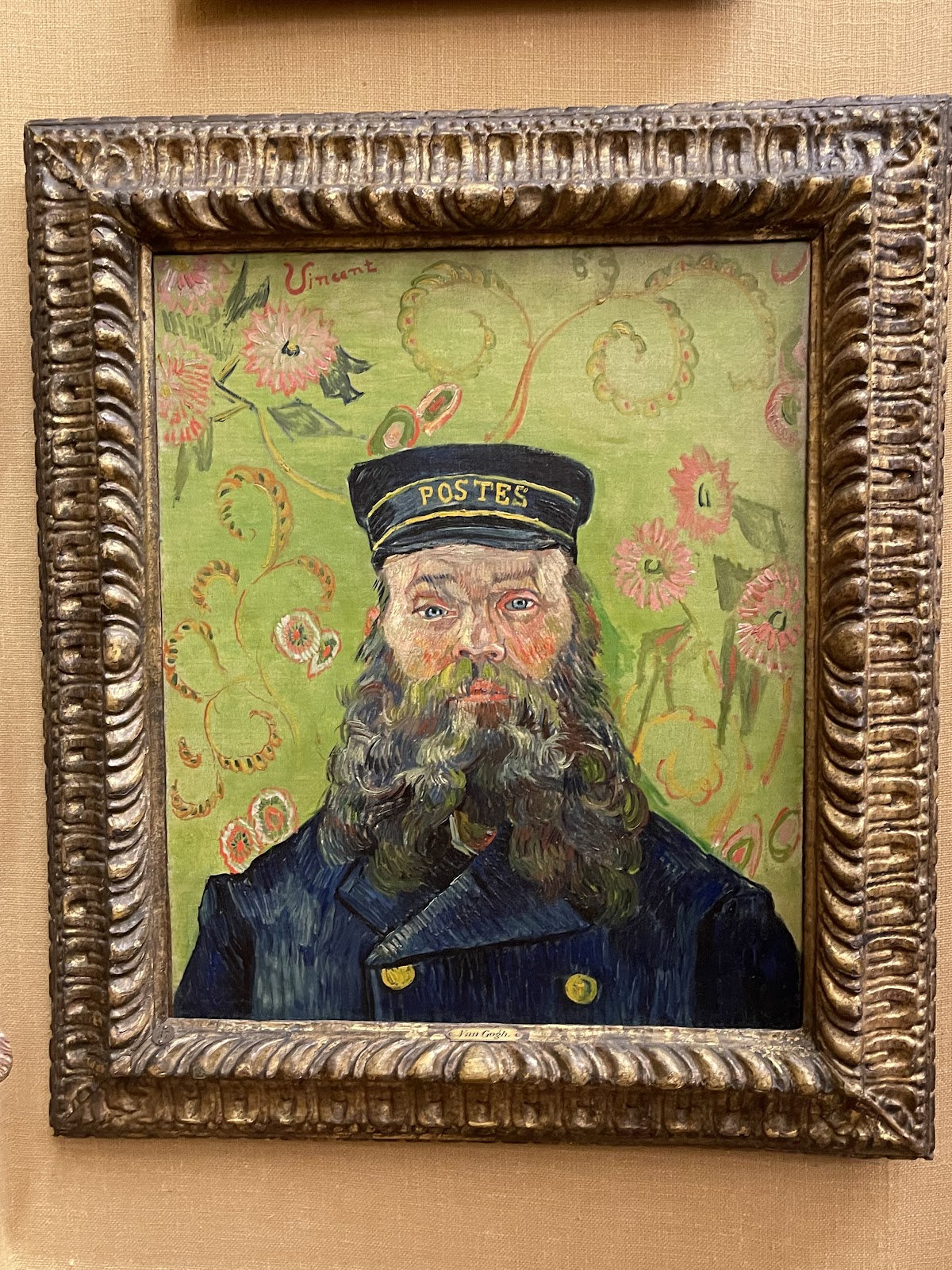
The Barnes Foundation, Philadelphia: One Frame and How It Is Made
A building designed to manage how people move is also designed around one very good room.
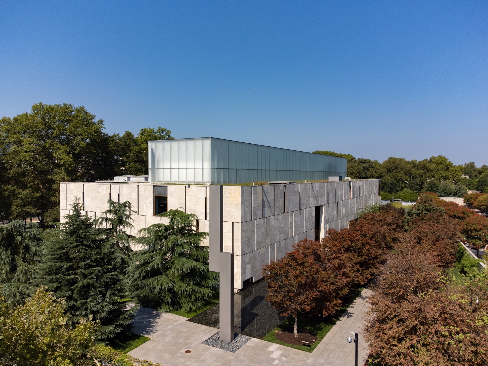
The Barnes Foundation’s layout helps manage the movement of guests and capture intimate moments without disruption, as its own description notes — which is an unusual thing to say about a venue, and a revealing one.
Buildings designed around controlled circulation tend to share a feature: a single large daylit volume that everything else opens off. It exists because a building that moves people deliberately needs somewhere for them to gather, pause and orient — and because in a museum that space is the one room with no light-sensitive material in it, it is also the only place where daylight can be let in generously.
That volume is the frame worth building a day around. A top-lit or generously glazed court in a contemporary museum is soft, even, bright, tall and uncluttered — and a couple placed in it is lit better than anywhere else in the building, against a background that is architecture rather than objects. This is written as that frame and the three things it needs. We have not photographed a wedding at the Barnes; contemporary museums with daylit courts behave consistently. Which spaces a booking includes, whether photography is permitted in the galleries, and whether stands are allowed are the questions for their team.
The Barnes Foundation at a glance
| Where | The parkway, Philadelphia, Pennsylvania |
| Character | A contemporary museum with a daylit court and controlled circulation |
| The frame | In the court — soft, even, tall, and free of objects |
| It needs | Position, a fix for the overhead light, and an exposure adjustment |
| Ask first | Spaces included, gallery photography, whether stands are allowed |
The frame, and the three things it needs
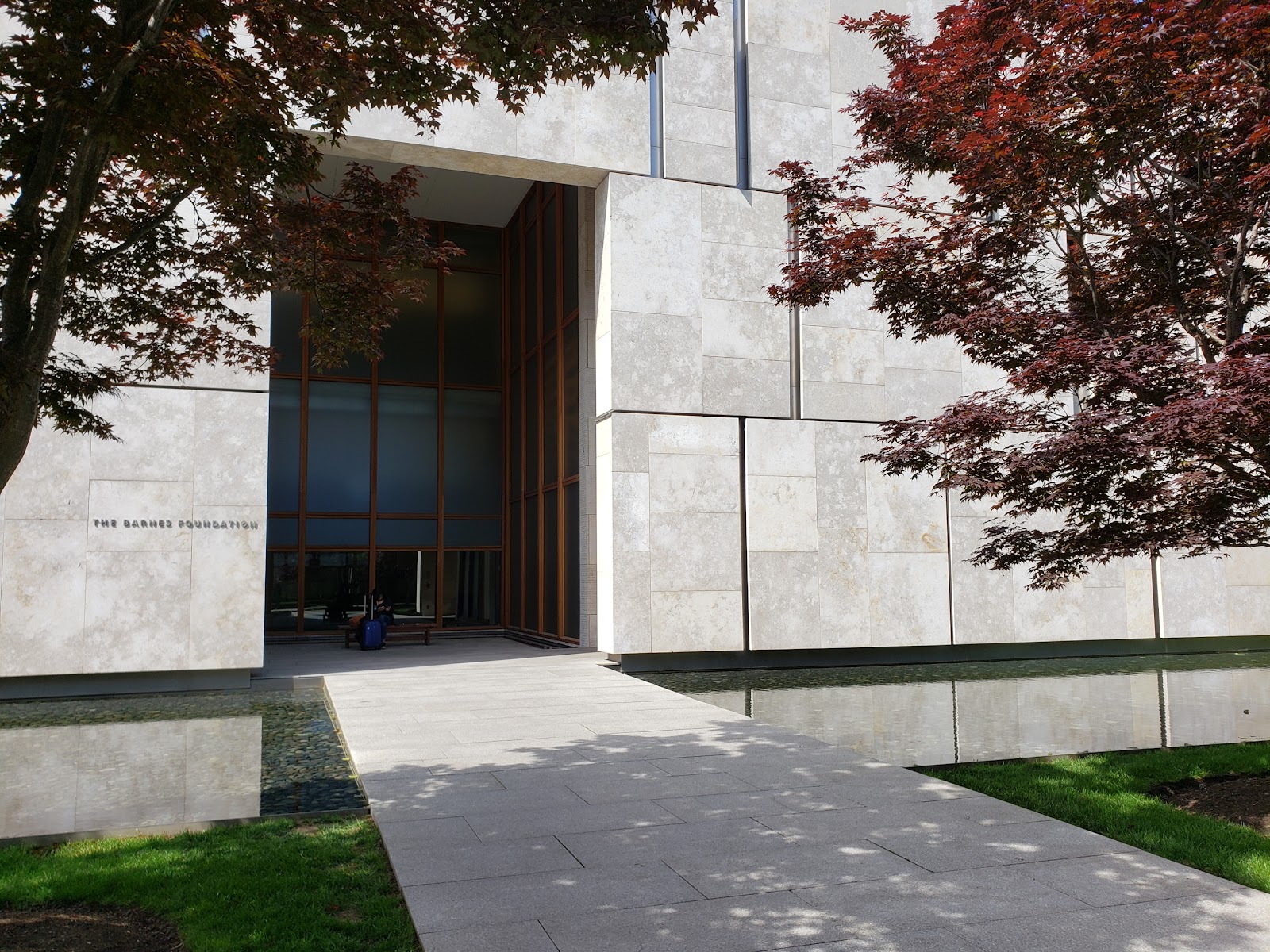
The first requirement is position, and in a top-lit court it is not the middle. Light entering through a roof arrives from directly above, which means standing in the centre of the space puts a subject under it — flat, top-down illumination that darkens eye sockets and marks the line under the nose. Against a wall, or towards one end, light arrives partly from above and partly bounced off the facing surface, which restores some direction.
Where the court has glazing in a wall as well as a roof, that wall is the answer: a subject two metres back from it gets a broad soft key with clear direction and enough level that the depth of the space still reads behind them. Two metres back rather than pressed against the glass is almost always right.
The second requirement is a fix for the overhead component, because even in the best position there is more light from above than from the front. The cheap fixes should be ready: a reflector held low bouncing light back up into the face, a pose with the chin lifted, or a small source at face height that overrides the geometry. Having none of them is the commonest reason portraits in a top-lit space look slightly hollow around the eyes.
The third requirement is exposure discipline, because pale surfaces and a bright roof fill most of the frame. A meter will want to darken it, so add half a stop to a stop over the metered reading and check that pale stone or plaster still holds texture rather than clipping. Pale surfaces also bounce neutral-to-cool light, which in flat weather renders skin slightly grey — a warm reflector, or a custom white balance set on a face in position, is the correction.
Contemporary architecture gives the fourth thing to manage, which is a lack of separation. Spare pale surfaces under even light mean a subject and a background are the same tone, so backgrounds have to be built rather than found: depth so the background sits well behind, a wide aperture so it goes soft, placement against the darkest element available, and negative fill — something dark on the shadow side of a face, which subtracts bounced light and deepens the gradient. In a pale court, subtracting beats adding.
Symmetry is usually available in a building like this and it rewards precision: clean lines and repeated modules make compositions that read immediately and collapse under small errors, so level deliberately and either centre exactly or clearly do not.
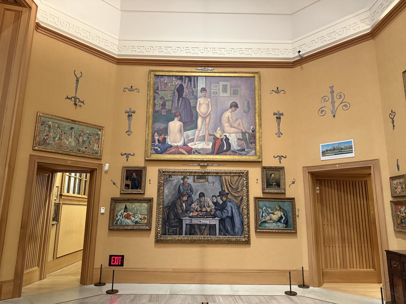
The galleries, and controlled circulation
Galleries are the part to plan around rather than into. Conservation caps the light level two or three stops below comfortable; display fittings aim down from the ceiling at works, which is the overhead problem in its strongest form; and museum sources are frequently narrow-spectrum, chosen for low ultraviolet output rather than colour rendering, which renders skin sallow or plum even at technically correct white balance. No adjustment recovers a wavelength that was never emitted.
Gallery walls in a museum of this kind may also be mid-tone or deliberately coloured, which removes bounce entirely and adds a cast of its own. Every source has to be direct and modified.
Where photography is permitted at all, keep any added light small: a gridded source on the couple alone, spilling onto nothing, about a stop under a correct reading for the room. A dim gallery with a small pool of light reads as atmospheric; flooded, it reads as a lit room with pictures in it, and it is also the version most likely to breach the rules.
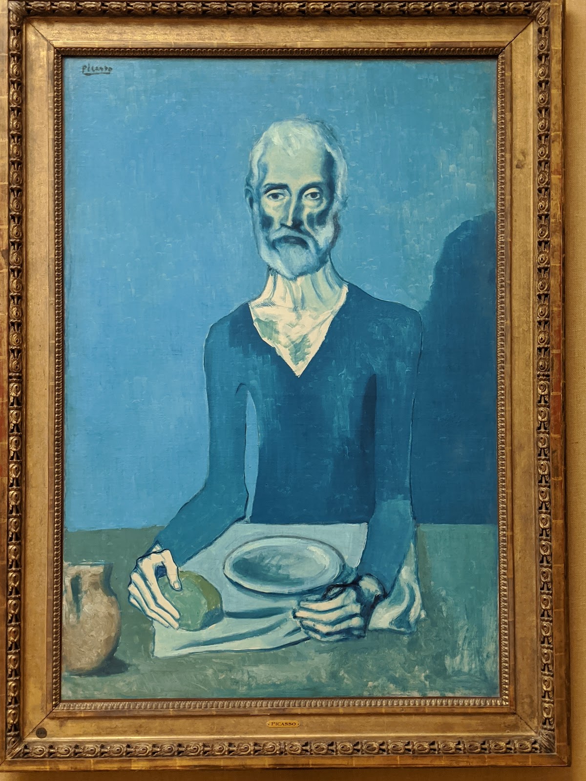
Densely hung collections deserve a specific note, because they behave differently from sparsely hung ones. A wall carrying many works at once is visual noise rather than a background: there is no single piece to commit to and no way to subordinate one without subordinating all. The honest answer is either a long lens at a wide aperture so the whole wall becomes a field of colour and texture, or standing the couple somewhere the wall is not.
There is also a permissions layer that a hotel does not have, and at a collection it is more extensive than most people expect. Whether photography is permitted, whether stands are permitted, and whether flash is permitted are three separate questions and venues frequently answer them differently — so all three belong in writing rather than in a conversation on the day.
The controlled circulation the building is known for is genuinely useful to a photographer, and it is worth exploiting rather than merely accepting. A building that moves guests deliberately means fewer people wandering through frames, a predictable sequence of rooms, and a known point at which everybody will be in one place — which is exactly when the group photograph should happen. Ask how the flow is designed and build the coverage onto it rather than against it.
- Work against a wall or towards an end, not the middle of a top-lit court
- Two metres back from wall glazing, not pressed against it
- Fix the overhead component with a low reflector or a lifted chin
- Add half a stop or more; pale surfaces and a bright roof pull a meter dark
- In a pale court, subtract with negative fill rather than adding light
The parkway, the grid, and Philadelphia's year
Outside, the parkway is the most useful street in the city for a wedding and it is worth knowing why. Philadelphia’s Center City is a strict grid oriented close to the compass, which means the east-west streets take low sun straight down their length and the north-south ones do not — a fact that can be planned from a map rather than discovered on foot.
The parkway is the exception: it runs diagonally across that grid, so it takes low sun at an angle no other street does, and it is tree-lined, which gives canopy shade along its length. Those two facts make it both the reliable raking-light position and the reliable midday shade, within a few minutes’ walk of any venue on it.
Canopy shade is the summer resource and dapple is its hazard: hot spots several stops above the surrounding shadow across a face, shifting with every breeze. Full shade, open light, or wait for the sun to drop below the trees. And green bounce from dense foliage throws green onto nearby skin, which is localised and therefore uncorrectable globally — a custom white balance set on a face in position is the answer.
Red brick is Philadelphia’s material away from the parkway and it is the friendly one: brick bounces warm and flatters skin, where a pale modern museum bounces cool and can grey it. Which surface a couple stands near changes the colour of a face here more than people expect, and walking two blocks off the parkway into brick is a deliberate improvement rather than a change of scene.
White marble steps front many Philadelphia rowhouses and act as low reflectors, bouncing light up into a face to fill the shadow overhead sun creates — a located frame that is also a lit one. Cobbles in the older quarters give strong texture that reads only in raking light, and a genuine trip hazard in heels.
Philadelphia’s four seasons change the plan substantially. Summer is humid with afternoon thunderstorms common rather than rare, which for a museum is an advantage: the day continues indoors without a decision. Autumn colour on a tree-lined parkway in late October is a genuine asset and a short window.
Winter days are short, with sunset in the middle of the afternoon in December, which compresses the outdoor window into a couple of hours — and a top-lit court is where that matters most, because the building’s daylit character may be gone before guests sit down. Snow is the compensation and it is the best natural fill there is, while fooling a meter by about two stops; and snow seen through a glazed court, with the interior lit, is one of the better frames a modern museum offers.
Humidity and cold both produce lens fogging, in opposite directions, and both take many minutes to clear — so equipment needs to come towards the temperature of where it is going before it gets there.
More frames from The Barnes Foundation
The Barnes Foundation wedding photography: common questions
Why is the daylit court the frame?
Because it is the one room in a museum with no light-sensitive material in it, so daylight can be let in generously — and the background is architecture rather than objects.
Where should you stand in a top-lit court?
Against a wall or towards an end, not the middle. The centre sits directly under the roof light, which is flat top-down illumination. Where there is wall glazing, two metres back from it is better still.
What fixes the overhead light?
A reflector held low, a lifted chin, or a small source at face height. Without one of them, portraits in a top-lit space look slightly hollow around the eyes.
What exposure adjustment is needed?
Half a stop to a stop over the meter, because pale surfaces and a bright roof pull it dark. And a warm reflector, since pale surfaces bounce cool and can grey skin.
How do you handle a densely hung gallery wall?
As visual noise rather than as a background. Either a long lens at a wide aperture so the whole wall becomes a field of colour, or stand the couple somewhere the wall is not.
How is controlled circulation useful?
It means fewer people wandering through frames, a predictable sequence of rooms, and a known point when everybody is in one place — which is exactly when the group photograph should happen.
More Pennsylvania venue guides
We are writing a photographer’s guide to every venue we would happily shoot in Pennsylvania. Here are three more, plus the full index:
- The Bellevue Hotel, Philadelphia: Photographing a Grand City Hotel
- The Four Seasons Philadelphia: A Walk Up Through a High-Rise Hotel
- The Franklin Institute, Philadelphia: Field Notes for a Wedding Photographer
Planning a wedding at The Barnes Foundation?
One room, one position, one reflector. Tell us your date and we will plan the rest around it.