 The Four Seasons Philadelphia: A Walk Up Through a High-Rise Hotel
The Please Touch Museum, Philadelphia: What It Suits and What It Does Not
A monumental exhibition hall filled with primary-coloured exhibits is two registers that do not agree.
The Please Touch Museum is, by its own description, not just a venue but an experience that invites guests to relive the joy of childhood.
The photographic situation is more particular than that suggests, and it comes from the building rather than from the exhibits. Children’s museums of this kind frequently occupy grand nineteenth-century exhibition buildings — monumental, domed, symmetrical, in pale stone and plaster — and the collection inside is the opposite: bright, primary-coloured, plastic, and internally lit. That is two registers with nothing in common, sharing a single volume.
Where a couple actively wants that collision it is genuinely distinctive and nothing else offers it. Where they want one register and not the other, the building cannot separate them. This is written as suits and does not suit, because the match matters more here than the technique. We have not photographed a wedding at the Please Touch Museum; grand exhibition buildings and children’s exhibits both behave consistently. Which spaces a booking includes, whether exhibits can be screened or unlit, and whether the architecture can be used without the collection in frame are the questions for their team — the last one changes the day most.
The Please Touch Museum at a glance
| Where | Philadelphia, Pennsylvania |
| Character | A children’s museum in a grand domed nineteenth-century exhibition building |
| The collision | Monumental pale architecture against bright primary-coloured exhibits |
| Suits | Couples who want the collision, large counts, weatherproofing |
| Ask first | Whether the architecture can be used without the exhibits in frame |
The two registers, and what each needs
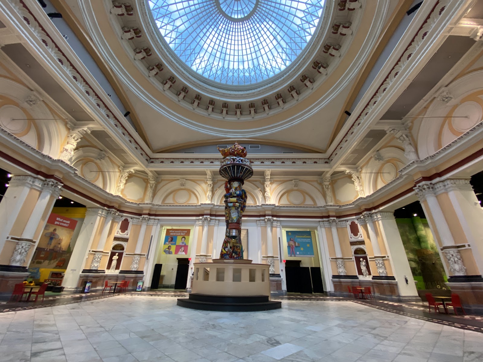
A monumental exhibition hall is one of the best interiors any city offers. It is tall and symmetrical, so the composition is half made before the camera is raised; it holds nothing light-sensitive, so it is generously lit; it is finished in pale stone and plaster, which raises ambient across the whole volume; and it is lit from above, through a dome or high glazing, which gives soft even illumination that is the same everywhere.
That evenness makes groups easy and position almost unimportant, and it darkens eye sockets on everybody, so the cheap fixes should be ready: a reflector held low, a lifted chin, or a small face-height source. Pale surfaces also push a meter dark, so add a stop or more exactly as for snow and check the plaster still holds texture rather than clipping. And pale stone bounces neutral-to-cool light, which renders skin slightly grey in flat weather — a warm reflector or a warm gel is worth carrying specifically.
Symmetry rewards precision. A frame centred on a domed hall collapses if the camera is off centre or a degree out of level, so level deliberately and either centre exactly or clearly do not. And the dome is worth pointing a camera straight up at once, because converging coffers or ribs with a couple small beneath make a composition almost nobody takes.
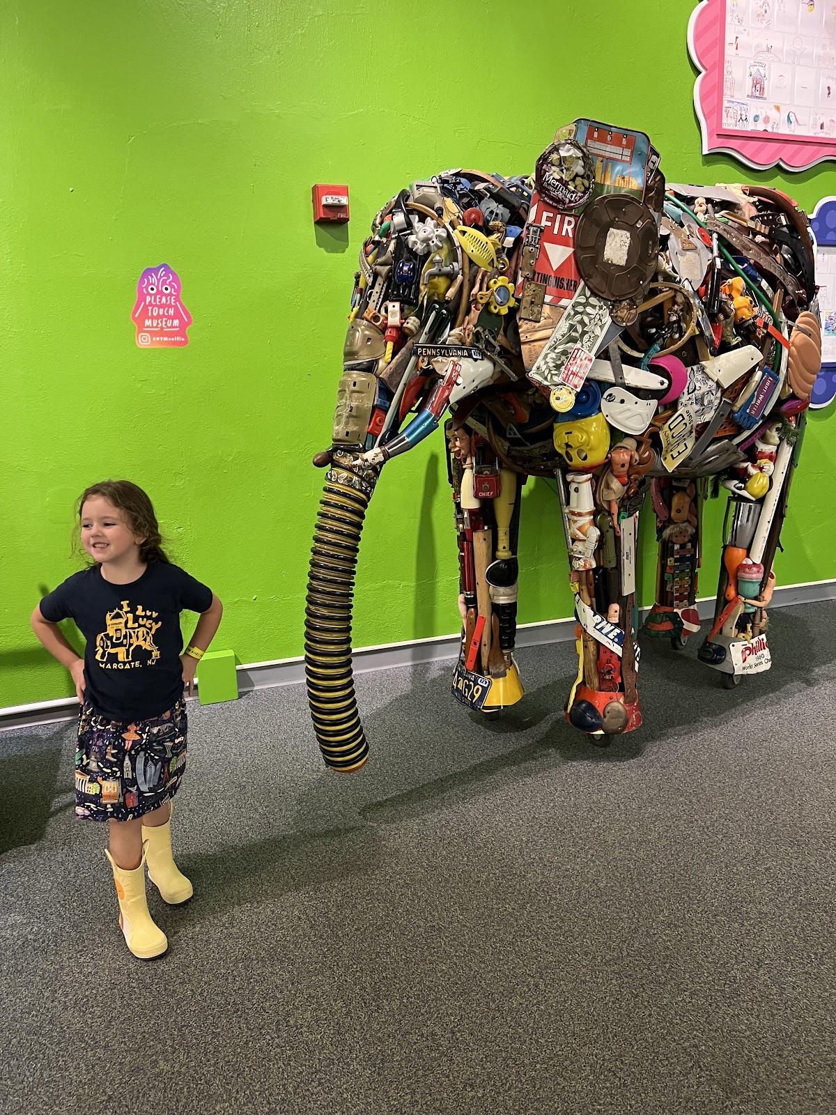
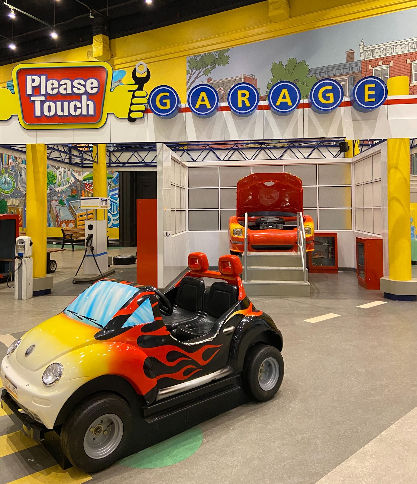
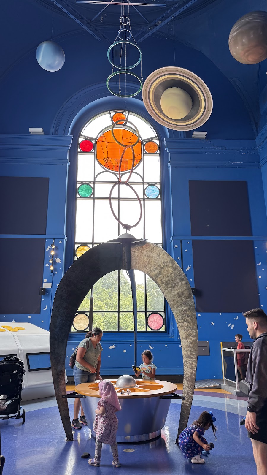
The exhibits are the other register and they are a colour problem before they are anything else. Bright primary surfaces reflect their own colour strongly onto anything near them, so a face standing beside a red panel picks up red and a face beside a blue one picks up blue — and because the cast is localised rather than global, white balance cannot separate it from the subject.
Where exhibits are internally lit, it is worse: a face lit by two coloured displays from two directions has two casts simultaneously and there is no single correction. One gelled source at face height, bright enough to dominate what falls on skin, with white balance set to it, is the answer — the exhibits then stay as coloured as they are, which is what makes the frame, while the faces stay consistent.
Scale is the third thing to manage and it is specific to this venue type. Exhibits built for children are small — low counters, short doorways, child-height furniture — which means an adult standing among them reads as oversized. That is either the joke, and worth committing to deliberately, or it is an awkwardness that needs excluding with a tighter frame. Half-in fails, as always.
Who it suits
The collision is the product and where a couple wants it there is nothing comparable — a grand domed hall full of bright colour is a photograph nobody else at the wedding will have seen before.
These briefs are well served here:
- Couples who actively want colour, play and a gallery unlike any other
- Larger guest counts, which a monumental exhibition hall absorbs easily
- Anyone who wants Philadelphia weather to be irrelevant to the day
- Weddings with many children present, for whom the venue is genuinely fun
- Photographers happy to bring a gelled source and use it consistently
Who should look elsewhere
The reverse list is not a criticism. A children’s museum is succeeding when it is bright, colourful and full of things to touch; the only question is whether that is what the day is meant to look like.
Several reasonable briefs fight the building from the first frame:
- Couples wanting a restrained, neutral or period aesthetic in the photographs
- Anyone whose references are warm timber, brick or muted colour
- Small intimate weddings, which read as sparse in a monumental hall
- Briefs where the architecture must appear without the collection in frame
- Photographers unwilling to gel a light, since the colour cannot be edited out
Working it, outside, and Philadelphia's year
The single most valuable request is whether the architecture can be used without the collection in frame — a cleared area, an upper gallery, a stair hall, or an hour before exhibits are lit. If some part of the building can be photographed as architecture alone, that is where the formal frames belong, and the answer transforms the plan.
Failing that, the practical method is to divide the coverage into a colour set and an architecture set and shoot them differently. The colour set commits: exhibits as saturated background, one gelled source on the faces, wide apertures so the colour becomes fields rather than objects. The architecture set excludes: long lenses, tight framing, and positions chosen so the frame contains stone and plaster rather than plastic.
Mixing the two produces neither, and the wide frames are the ones worth the most preparation because they are the ones that show the building.
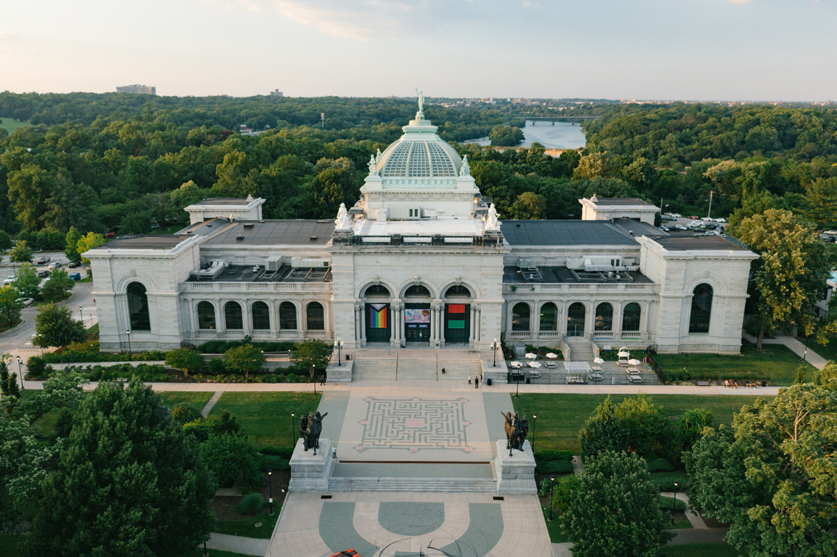
Outside, a grand exhibition building usually sits in parkland or on open ground, which gives clean sight lines and a low horizon — and rewards a low camera, because dropping close to the ground pushes the horizon down and lets the building’s dome and elevation occupy the upper frame rather than sitting in the middle of it.
Open ground means no shade, so mature trees at the edge of the site are the midday resource, with dapple as the hazard: hot spots several stops above the surrounding shadow, shifting with any breeze, so full shade, open light, or wait.
The last ninety minutes are when the exterior becomes worth photographing in its own right, because pale stone and plaster show their texture only when light runs along them — a facade that looks flat and chalky at noon separates into planes and shadowed detail in raking light. Which elevation receives it depends on orientation, so one walk around is worth more than any accessory.
Philadelphia’s four seasons change the outdoor half. Summer is humid with afternoon thunderstorms common rather than rare, which for a large enclosed hall is an advantage — the day continues without a decision. Autumn in parkland in late October is a genuine asset and a short window.
Winter days are short, with sunset in the middle of the afternoon in December, which compresses the outdoor window into a couple of hours. Snow is the compensation and it is the best natural fill there is, lifting exactly the shadows a low sun carves while fooling a meter by about two stops — though against pale stone the two together will clip if the exposure is not watched.
Humidity and cold both fog a lens in opposite directions, and both take many minutes to clear, so let equipment come towards the temperature of where it is going before it gets there.
More frames from The Please Touch Museum
The Please Touch Museum wedding photography: common questions
What is the photographic situation here?
Two registers with nothing in common in one volume: a monumental pale domed exhibition building, and bright primary-coloured internally lit exhibits.
What does the architecture need?
A fix for the overhead light, a stop or more of added exposure on pale surfaces, and a warm reflector or gel — because pale stone bounces cool and can grey skin.
Why can't the exhibit colour be corrected?
Because it is localised. A face beside a red panel picks up red and one beside blue picks up blue, and white balance is a single global adjustment. Two coloured displays on one face have no single fix.
What is the scale problem?
Exhibits built for children are small, so an adult among them reads as oversized. That is either the joke, committed to deliberately, or an awkwardness to exclude with a tighter frame.
What is the most valuable request?
Whether the architecture can be used without the collection in frame — a cleared area, an upper gallery, or an hour before exhibits are lit. That answer transforms the plan.
How should the coverage be divided?
Into a colour set and an architecture set, shot differently. The colour set commits with a gelled key and wide apertures; the architecture set excludes with long lenses and chosen positions.
More Pennsylvania venue guides
We are writing a photographer’s guide to every venue we would happily shoot in Pennsylvania. Here are three more, plus the full index:
- The Ritz-Carlton Philadelphia: The One Decision That Governs Everything
- The Simeone Museum, Philadelphia: A Walk Through a Vehicle Collection
- The Union League of Philadelphia: Photographing a Historic Private Club
Planning a wedding at The Please Touch Museum?
Ask whether the architecture can be used alone. Tell us your date and we will ask.