 Overhills Mansion: Who This Venue Suits, and Who It Doesn’t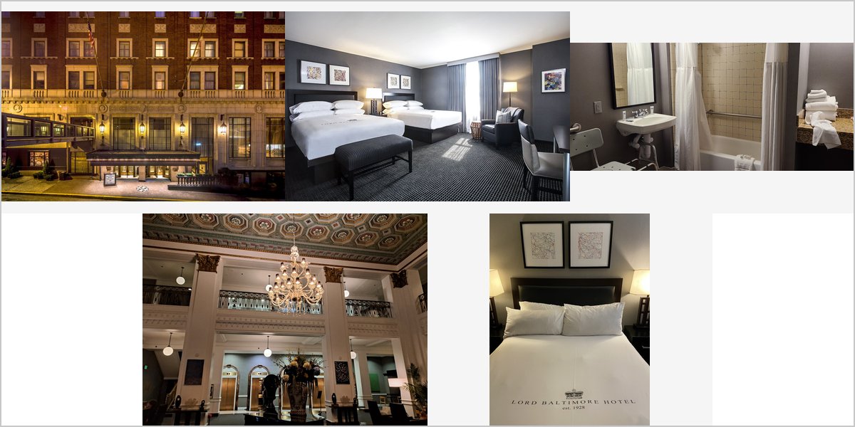
July 2, 2026
The Lord Baltimore Hotel: Lighting a 1928 Art Deco Ballroom
Art Deco is a gift to a photographer: it is built on pattern, symmetry and metallic surfaces. It also has a specific lighting trap that flattens those qualities if you miss it.
The Lord Baltimore Hotel opened in 1928, a 22-storey tower in downtown Baltimore and for a time the tallest building in Maryland. It is Art Deco in design, with a restored ballroom and period detailing through the public rooms — geometric plasterwork, metallic finishes, patterned floors and the strong symmetry that defines the style.
Art Deco is one of the most photogenic architectural idioms there is, for a specific reason: it is built on repetition and geometry rather than on organic ornament. Pattern reads beautifully in a photograph. Symmetry gives a frame an obvious structure. And metallic surfaces produce specular highlights that add sparkle a matte room never has.
The trap is that all three of those qualities depend on directional light, and the default lighting approach at a wedding reception — flat frontal flash — destroys all of them at once. That is the technical heart of this guide. We have not photographed a wedding here; room configurations and hotel policy are for their events team, but the optics of Deco interiors are consistent.
Lord Baltimore Hotel at a glance
| Where | Baltimore Street, downtown Baltimore, Maryland |
| Opened | 1928; 22 storeys, once the tallest building in Maryland |
| Character | Art Deco — geometric plasterwork, metallic finishes, patterned floors, strong symmetry |
| Light | Warm artificial in the event spaces; daylight in the guest rooms |
| Technical headline | Deco depends on directional light — flat frontal flash flattens everything that makes it work |
Why flat flash ruins an Art Deco room
Geometric plasterwork is only visible because of the shadows it casts. A stepped cornice, a fluted pilaster, a chevron relief — each of these reads as three-dimensional because light strikes it from an angle and the raised parts shade the recessed parts. Light it frontally, from the camera position, and those shadows disappear. The relief flattens into a flat pattern, and the room’s defining quality is gone.
The same applies to metallic surfaces. Brass, chrome and gilt look like metal because they produce specular highlights — bright points where the surface reflects a light source directly. Frontal flash produces one dull highlight in the middle of each surface; raking light from the side produces a line of bright highlights that reads unmistakably as polished metal.
So the rule in a Deco room is: light from the side, never from the front. One flash on a stand placed well off axis, feathered so the edge of the beam skims across the wall, will make the plasterwork stand up and the metal gleam. It is the same amount of equipment as a frontal setup and the difference in the photographs is substantial.
Symmetry demands precision
Deco interiors are usually strictly symmetrical, and symmetry is unforgiving. An off-centre composition or a tilted horizon is immediately obvious when the architecture has a clear axis, in a way it is not in an asymmetric Victorian room. A frame that is nearly centred looks like a mistake; a frame that is exactly centred looks intentional and powerful.
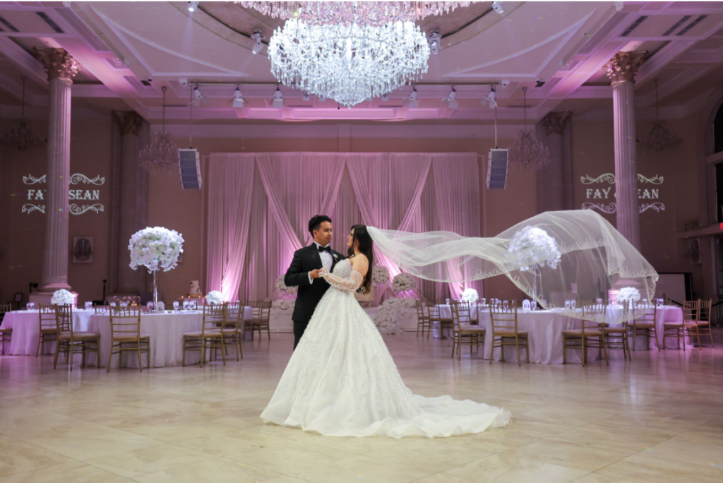
So slow down for the architectural frames. Find the axis, centre it properly, level the camera, and use the geometry as the composition. A ballroom shot straight down its centre line with the couple at the vanishing point is a very strong image and it requires nothing but care.
Corollary: put the couple on the axis, not beside it. In an asymmetric room you place people off-centre for visual interest. In a symmetric Deco room, centring them reinforces the architecture instead of fighting it.
Chandeliers, patterned floors and the exposure order
The exposure hierarchy in a period ballroom is always the same: fixtures are brightest, faces matter most, and the room can look after itself. Expose so the light fittings retain structure rather than blowing to white, bring faces up with your own light, and accept that the overall frame sits darker than instinct wants.
Patterned floors are a Deco-specific asset worth exploiting. A strong geometric floor gives you a compositional element that no other era provides, and it photographs best from a slightly elevated position where the pattern reads as pattern rather than as perspective. If there is a balcony or a staircase landing, use it for one frame looking down — the floor becomes the subject and the people become figures on it.
On colour, the usual differential applies: 1928 fixtures are warm tungsten, so keep the room warm and light faces slightly cooler so skin retains some neutrality. Set white balance manually per space, because a lobby, a ballroom and a guest room will not match.
Daylight, height, and downtown outside
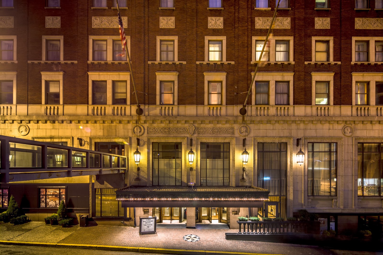
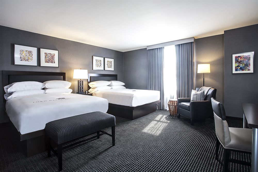
As in any grand hotel, the guest rooms hold the only real daylight, and in a 22-storey tower the upper floors also hold a view. Ask for a high floor for the preparation photographs: you get window light and a city outlook in the same room, which is more than most hotels offer.
Outside, downtown Baltimore gives you early twentieth-century commercial architecture, and the twenty minutes after sunset is when it comes alive — streetlights balancing the sky, stone and terracotta holding colour, wet asphalt doubling every light source if it has rained. Schedule ten minutes for it as a fixed item.
The Deco exterior itself is worth a frame. A 1928 tower has a distinctive stepped silhouette, and shot from across the street with a longer lens it identifies the venue instantly — which is the job of an establishing image and one that interior frames cannot do.
What works in your favour
- Art Deco geometry and symmetry give frames a built-in structure that other eras do not
- Metallic finishes produce genuine specular sparkle under raking light
- Patterned floors offer a compositional element unique to the period
- A 22-storey tower means high guest rooms with both window light and a city view
- Downtown location with early twentieth-century architecture for dusk portraits
What to plan around
- Frontal flash flattens plasterwork relief and kills metallic highlights — side light is mandatory
- Strict symmetry is unforgiving of off-centre or tilted composition
- No daylight in the event spaces; the reception is entirely a lighting assignment
- Warm 1928 fixtures need a deliberate differential white balance to keep skin natural
- A working downtown hotel — exclusive access to public areas is unlikely
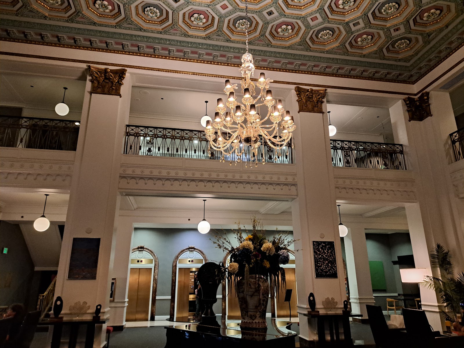
More frames from Lord Baltimore Hotel
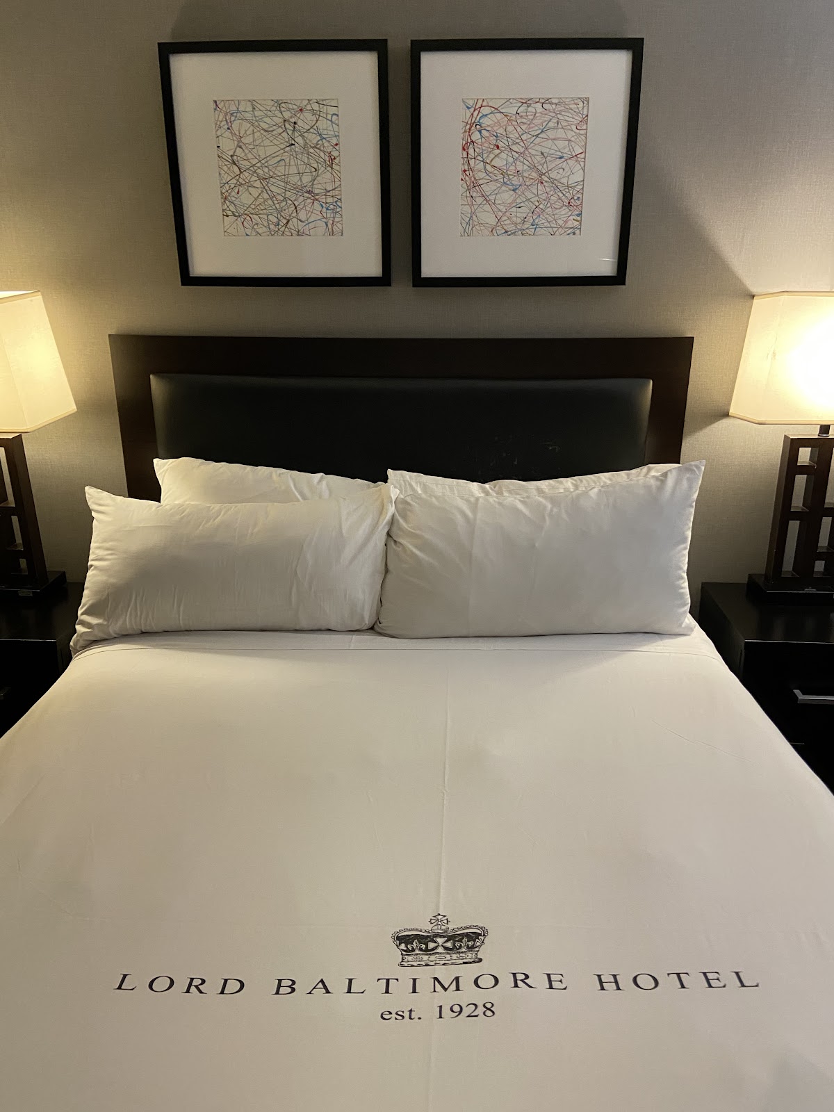
Lord Baltimore Hotel wedding photography: common questions
Why does flash direction matter so much in an Art Deco room?
Because Deco relief is only visible through the shadows it casts. Stepped cornices, fluted pilasters and chevron details read as three-dimensional because light strikes them at an angle. Light them frontally and the relief flattens into a flat pattern, and the room’s defining quality disappears from the photograph.
How should metallic surfaces be lit?
From the side, so the light rakes across them. Brass and chrome look like metal because of specular highlights, and raking light produces a line of bright points that reads unmistakably as polished metal. Frontal flash produces one dull highlight per surface and the metal looks like painted board.
What is the strongest composition here?
Straight down the room’s centre line, exactly centred and level, with the couple on the axis rather than beside it. Deco symmetry is unforgiving — nearly centred looks like a mistake, exactly centred looks powerful. It costs nothing but care.
Is there anything special about the floors?
Yes. Strong geometric Deco floors are a compositional element no other era supplies, and they photograph best from slightly above, where the pattern reads as pattern rather than as perspective. If there is a balcony or stair landing, take one frame looking down and let the floor be the subject.
Where do the getting-ready photographs happen?
A high guest room. In a 22-storey tower the upper floors give you window light and a city view in the same room, which is more than most hotels can offer. Turn off the room lights so daylight and tungsten are not mixing, and work close to the glass.
More Baltimore venue guides
We are writing a photographer’s guide to every venue we would happily shoot in Baltimore. Here are three more, plus the full index:
- Overhills Mansion: Who This Venue Suits, and Who It Doesn’t
- The Rawlings Conservatory: A Walk-Through of Glass Houses
- The Belvedere: The Technical Side of a 1903 Grand Hotel
All Baltimore Wedding Venues →
Planning a wedding at Lord Baltimore Hotel?
Deco rooms reward one decision above all others: put the light to the side. Tell us your date and we will send a lighting plan built around the plasterwork and the metalwork, plus the dusk window for that evening.