 The Portland Regency: A Season-by-Season Guide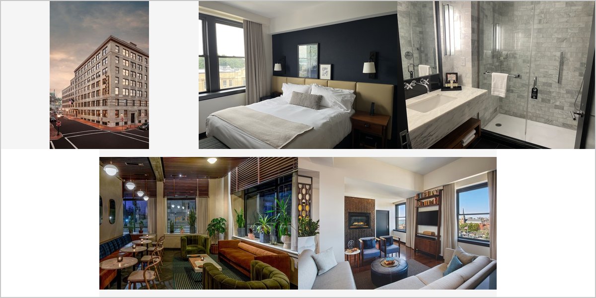
May 16, 2026
The Press Hotel: A Walk-Through of a Converted Newspaper Building
A converted newspaper building with a designed interior. Strong graphic character, a neutral palette, and it is easier to light than any historic hotel.
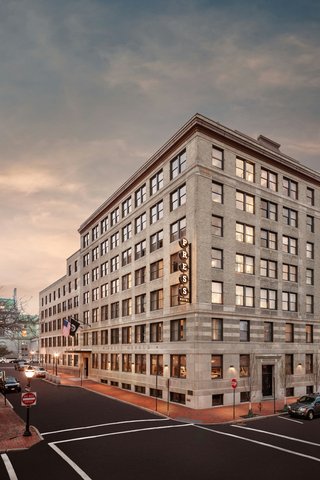
The Press Hotel occupies the former headquarters of the Portland Press Herald in downtown Portland, Maine, converted into a design hotel that leans deliberately into its origins — typographic detail, newspaper-themed graphics, period industrial features and a contemporary interior scheme built around them.
Photographically that produces an unusual combination. It has the character of a converted building, with original structure and detail. It has a designed contemporary interior, which means the surfaces are considered rather than accidental. And it has a largely neutral palette — greys, blacks, whites, typographic graphics — which is genuinely rare in a hotel and very helpful for skin tones.
This is a walk-through in shooting order. We have not photographed a wedding at the Press Hotel; converted commercial buildings and contemporary design interiors behave predictably. Which spaces your booking includes are for their events team.
The Press Hotel at a glance
| Where | Exchange Street, downtown Portland, Maine — the former Press Herald building |
| Character | Converted newspaper headquarters; typographic and industrial design scheme |
| Palette | Largely neutral — greys, blacks, whites and graphic detail |
| Light | Contemporary fixtures; guest rooms hold the daylight |
| The advantage | A neutral palette means clean skin tones with nothing to correct |
Why a neutral palette is worth more than it sounds
Almost every hotel in this series has a colour problem. Gilded ballrooms return amber, brick returns warm red, adobe returns warm ochre, pink marble returns rose, coloured rooms return their own hue. In each case the photographer has to manage skin tones against a room that is actively tinting them.
A grey, black and white interior does not do that. Neutral surfaces return neutral light, which means skin renders as skin with no correction needed and no differential white balance trick required. That is a genuine advantage and it makes the whole day technically simpler — one white balance setting, clean faces, no compromise between the room looking right and the people looking right.
It also means any colour you do introduce reads strongly. Florals, a dress, a suit, a bouquet — all of them stand out against a neutral ground in a way they cannot against patterned warm surfaces. In a monochrome interior the people are automatically the colour in the frame, which is exactly the hierarchy you want.
Guest rooms and the daylight
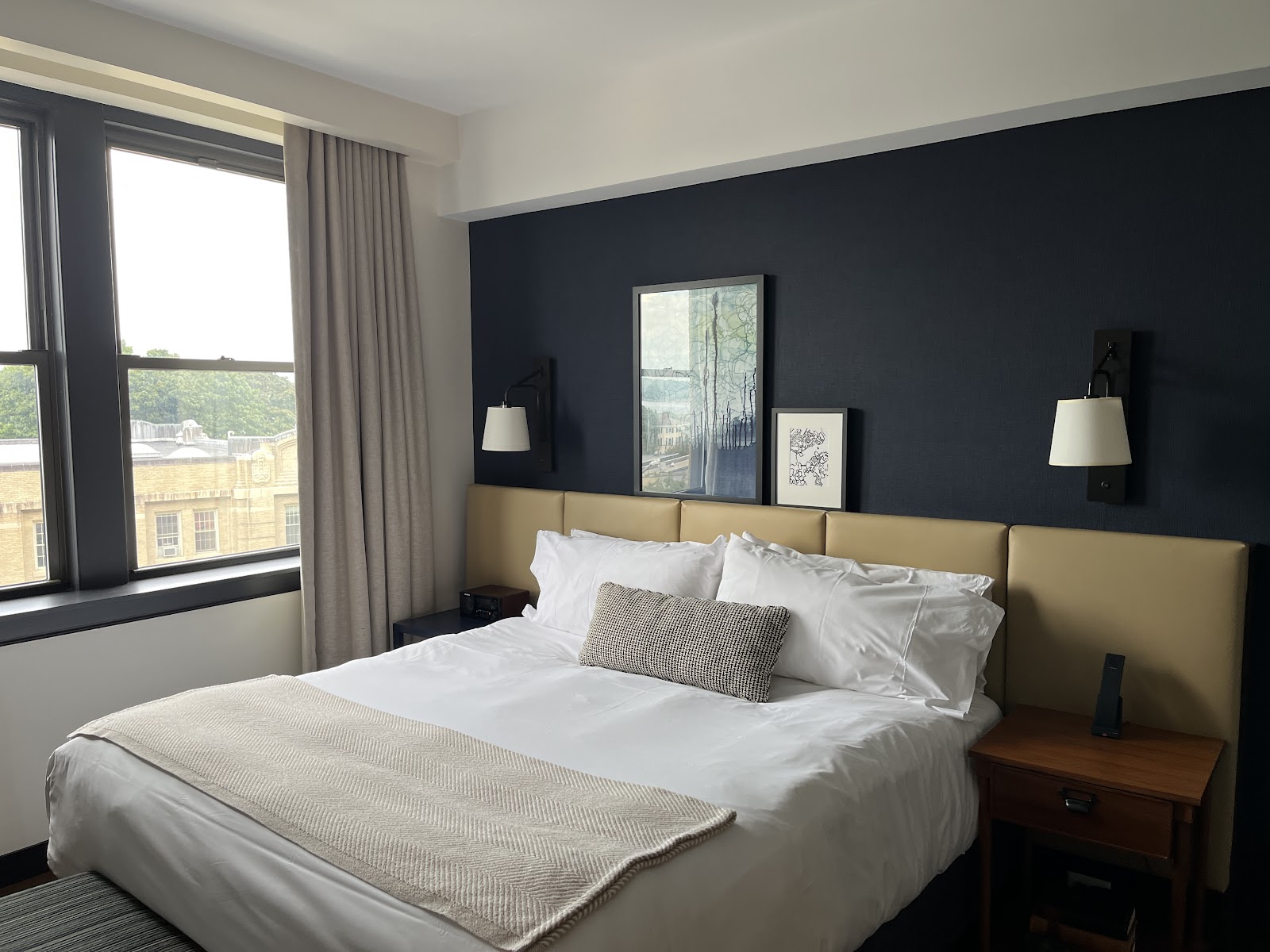
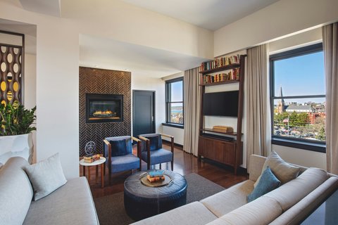
As in any hotel, guest rooms hold the daylight and the preparation coverage belongs there. A converted commercial building often has generous windows — offices needed light in a way hotel rooms do not — so the glazing may be better than a purpose-built hotel of the same size would offer.
The routine applies: every artificial fixture off so daylight and tungsten are not mixing, clutter moved out of frame, everything brought to within a metre or two of the glass. Ask for a higher floor for cleaner light and a better outlook.
In a design hotel the rooms themselves are usually worth including. Considered furniture, typographic detail and a neutral scheme mean a background that is genuinely good rather than something to exclude — which is not true in most hotels, where getting-ready photographs involve carefully framing out a headboard.
Typographic and industrial detail
The design scheme is the venue’s identity and it should be photographed deliberately rather than treated as wallpaper. Typographic graphics, original signage, printing-related detail, industrial fittings and any retained structure all give you strong graphic frames that state exactly where you are — which a neutral room otherwise would not.
Graphic elements are also useful compositionally. Large lettering, a grid, a repeated pattern gives a frame structure in a way a plain wall does not, and it lets you place a couple against something with rhythm. Use it as background rather than letting it compete: keep people clear of it so a wide aperture softens it, and make sure your subjects are the brightest thing in frame.
Detail frames of the typography and the industrial fittings cost nothing and they do a job that portraits cannot — they identify the building. In a hotel whose whole concept is its former life, those frames are the ones that explain the venue.
Event spaces, the Old Port and the timeline
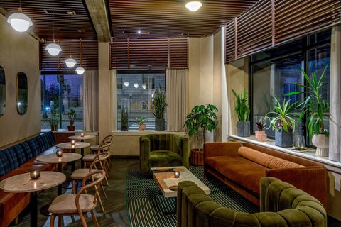
Event rooms in a contemporary conversion will be moderate in scale with pale or neutral ceilings, which means bounce flash genuinely works — a considerable advantage over a historic ballroom where the ceiling is too high and too dark. One bounced unit handles moving coverage and one gelled light on a stand handles a considered portrait. This is an easy room to light.
Outside, the location is excellent. The Press Hotel sits in downtown Portland with the Old Port a short walk away — cobbled streets, brick and granite warehouses, a working waterfront, and water that reflects light upward into faces. Portland’s coastal air is notably clear, so brick and granite read with real contrast in raking light.
The best exterior window is the last hour of daylight and the twenty minutes after sunset. Maine’s latitude makes that generous in summer, with usable light well past eight, and very short in winter with a mid-afternoon December sunset — so calculate it for the date rather than assuming.
For the order of the day: preparation in a higher-floor guest room; typographic and industrial detail frames while spaces are empty; portraits against graphic surfaces with your own light supplying direction; the Old Port in the last hour and at dusk; and the reception lit with bounce plus one stand light.
What works in your favour
- A neutral palette means clean skin tones with no correction and no white balance compromise
- Any colour you introduce reads strongly against a grey and black ground
- Converted commercial glazing is often more generous than a purpose-built hotel’s
- Design-hotel rooms are worth including rather than framing out
- Moderate neutral-ceilinged event rooms mean bounce flash genuinely works
What to plan around
- A neutral interior is quiet — graphic detail and your own light supply the interest
- Typographic surfaces compete with people unless separation is managed
- No daylight in the event spaces
- Maine’s extreme seasonal daylight swing must be calculated for the date
- A working downtown hotel; exclusive access to public areas is unlikely
More frames from The Press Hotel
The Press Hotel wedding photography: common questions
Why is a neutral palette an advantage?
Because almost every other hotel tints your skin tones — gilt returns amber, brick returns red, adobe returns ochre. Grey, black and white surfaces return neutral light, so skin renders as skin with no correction and no differential white balance trick. It also means any colour you bring reads strongly against the neutral ground.
Are the guest rooms good for getting-ready photographs?
Unusually so. A converted commercial building often has generous glazing because offices needed light, and a design-hotel room has considered furniture and a neutral scheme — so the background is genuinely good rather than something to frame out. Ask for a higher floor and turn all the artificial lights off.
How should the typographic detail be used?
As background and as its own subject. Large lettering and repeated patterns give a frame structure that a plain wall cannot, so keep people clear of the surface and let a wide aperture soften it. Then shoot the typography and industrial fittings on their own — those frames identify the building in a way portraits cannot.
Is it easy to light?
Yes, easier than any historic hotel here. Event rooms are moderate in scale with pale neutral ceilings, so a bounced flash returns useful light rather than disappearing into a high dark ceiling. One bounced unit plus one gelled light on a stand covers the whole reception comfortably.
What is outside?
The Old Port, a short walk away — cobbled streets, brick and granite warehouses, a working waterfront and water reflecting light upward into faces. Portland’s coastal air is notably clear, so brick and granite read with real contrast in the last hour of daylight.
More Portland, ME venue guides
We are writing a photographer’s guide to every venue we would happily shoot in Portland, ME. Here are three more, plus the full index:
- The State Theatre: Field Notes on a 1929 Movie Palace
- The Tate House: Who This 1755 House Suits
- Victoria Mansion: Who This 1860 Interior Suits
All Portland, ME Wedding Venues →
Planning a wedding at The Press Hotel?
A neutral hotel is a technically easy hotel, which leaves attention for the people. Tell us your date and we will plan the graphic frames, the guest-room light and the Old Port block.