 Hotel Saint Louis: A Walk-Through of an 1893 Union Trust Building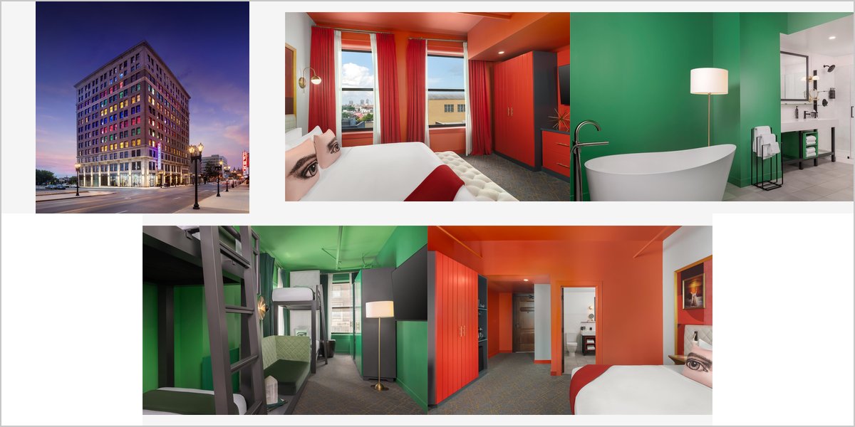
June 9, 2026
The Angad Arts Hotel: Who This Colour-Themed Venue Suits
Rooms saturated in single colours, chosen by mood. That is a genuinely unusual photographic proposition, and it will not suit every couple.
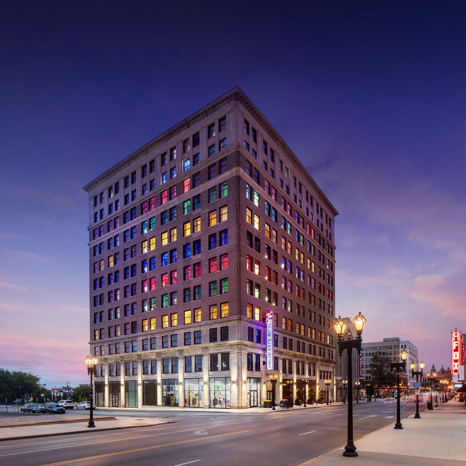
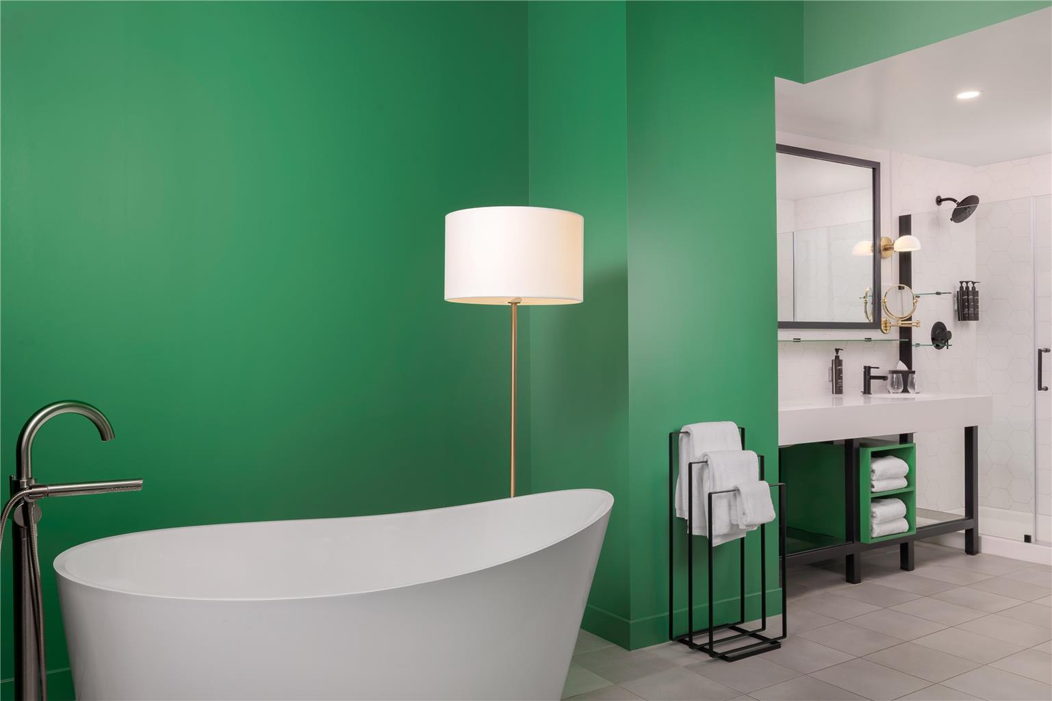
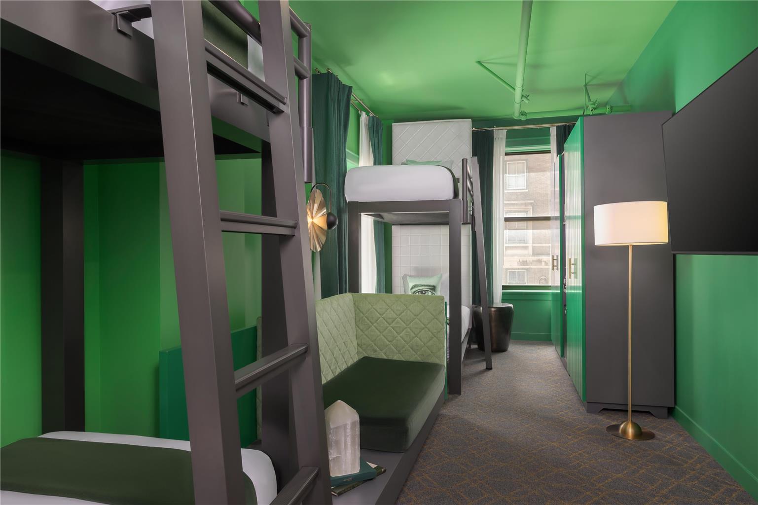
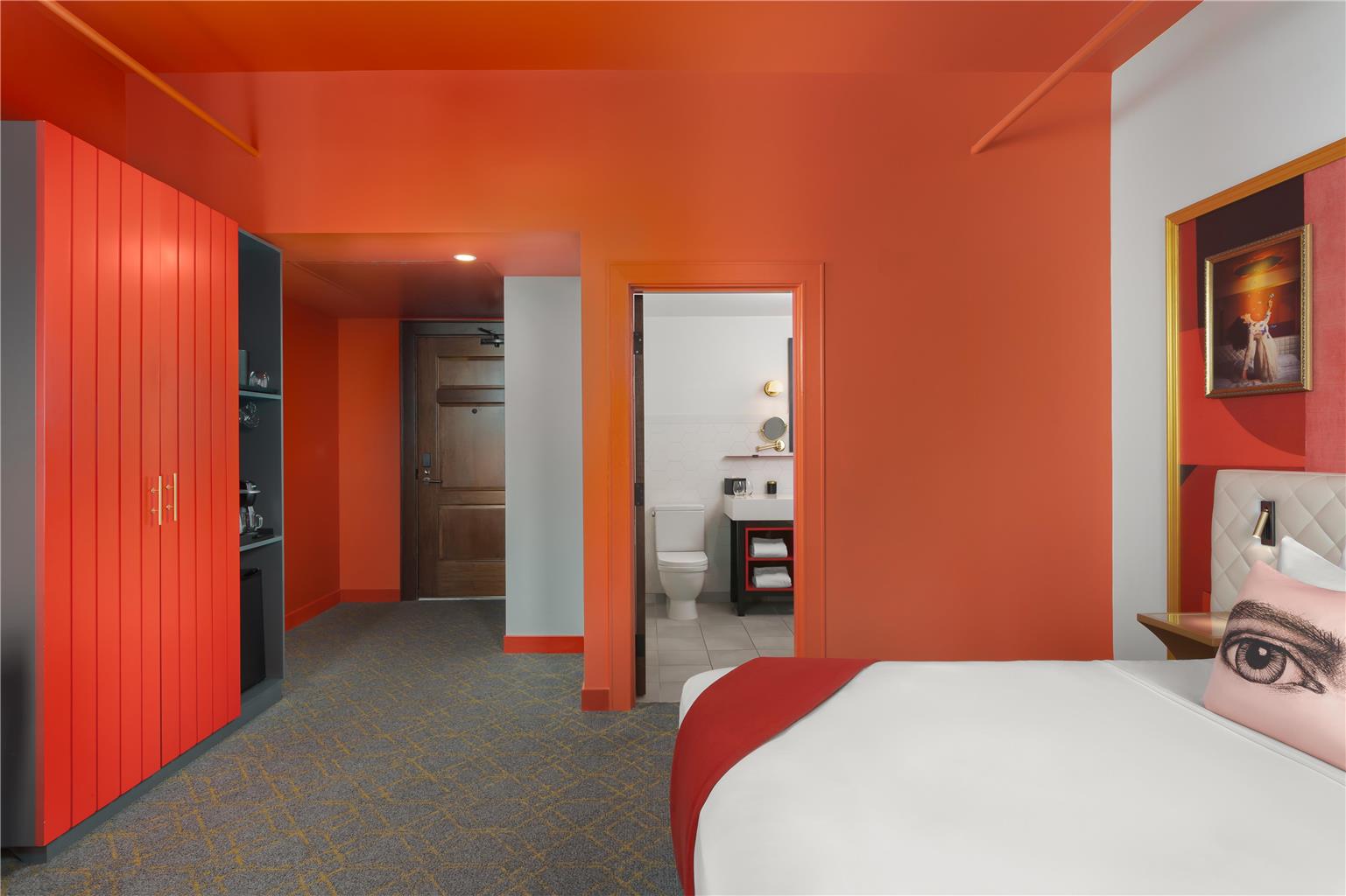
The Angad Arts Hotel sits in St. Louis’s Grand Center arts district, in a converted building, and its distinguishing concept is colour: guest rooms are themed in saturated single hues — blue, yellow, red, green — and guests choose a room according to the mood they want. There is also a rooftop space with city views.
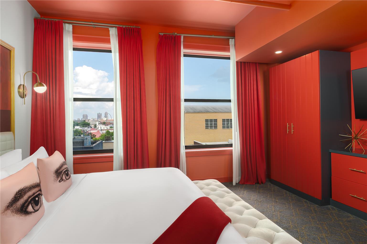
Photographically that is a proposition unlike any other hotel in this series. A room saturated in a single strong colour is not a neutral backdrop; it is a coloured light source, because every surface reflects its own hue onto anyone inside. Skin in a red room goes red. Skin in a green room goes green. This is physics, not styling, and it cannot be edited away without destroying the room.
So this is a fit assessment rather than a technical manual. We have not photographed a wedding at the Angad Arts Hotel; the behaviour of saturated monochrome interiors is entirely predictable. Which rooms and spaces your booking includes, and rooftop access, are for their events team.
Angad Arts Hotel at a glance
| Where | Grand Center arts district, St. Louis, Missouri |
| Concept | Guest rooms themed in saturated single colours, chosen by mood |
| Character | Contemporary arts hotel with a rooftop and city views |
| Light | Coloured rooms act as coloured light sources; rooftop gives daylight and a horizon |
| Core question | Do you want strongly coloured photographs? Here you will get them. |
What a saturated room actually does
Every surface in a room painted a single strong colour reflects that colour, so the light bouncing around inside becomes coloured light. Stand in a red room and red light falls on you from every direction. There is no neutral surface to balance it and no position that escapes it.
The consequence for skin is unavoidable. Faces pick up the room’s hue, and because it comes from everywhere rather than one direction, you cannot simply move someone into better light. A white dress in a blue room is a blue dress. That is not a fault to be corrected; it is what the venue is for.
The two coherent approaches are to commit or to override. Commit: set white balance so the room reads as its colour, accept that skin is tinted, and shoot it as a deliberately monochromatic image. That looks intentional and it suits the hotel’s concept. Override: light faces with a bright neutral source strong enough to dominate the ambient, so you get natural skin inside a coloured room. Both work. What fails is auto white balance and no added light, which produces frames that are neither.
Who this venue suits
Four kinds of couple, and the fit is narrow but strong.
- Couples who want bold, graphic, colour-led photographs. If your references are saturated and modern rather than soft and romantic, this hotel delivers something no historic venue can.
- Anyone with a design or arts sensibility. The concept is deliberate and the execution is consistent, and photographs taken here read as a considered choice rather than as a hotel room.
- Smaller, urban, contemporary weddings. This is a city hotel in an arts district, not a grand ballroom venue. It suits a modern city celebration.
- Couples who will actually use the colour. Choosing a room to match a palette, and letting the photographs be about that colour, is the way to get value from the venue.
Who should look elsewhere
This one genuinely matters, because the venue is seductive in its own photographs and unforgiving in practice.
- Anyone who wants natural skin tones without added light. In a saturated room that is not available. If untinted faces in ambient light are important, this is the wrong building.
- Couples wanting classic or timeless imagery. Strong colour dates a photograph to a moment and an aesthetic. That is fine if you want it and a problem if you do not.
- Anyone expecting a traditional ballroom. This is a contemporary arts hotel. There is no ornate plasterwork and no grand staircase.
- Couples with a large formal guest list. The scale and character suit a smaller urban celebration rather than a large traditional one.
Making it work, and the rooftop
If you book it, use it properly. Choose the room colour deliberately with the photographs in mind — deep blue and green are more forgiving on skin than red and yellow, which push faces toward flushed and jaundiced respectively. Then either commit to the monochrome look or bring enough neutral light to override it, and be consistent across the set so the gallery holds together.
Practically: a bright neutral key at close range is what overrides a coloured room, and it needs to be genuinely brighter than the ambient rather than a token fill. Half-measures produce faces that are partly corrected and look odd. Set white balance manually in each room, since a blue room and a yellow room need entirely different settings.
The rooftop is the counterweight and it is important. Open sky means neutral daylight, city views, room for a group, and the twenty minutes after sunset with downtown lit. It is the one space at this hotel where skin is skin and the light is ordinary in the best sense. Confirm access, because without it the whole gallery is tinted.
Grand Center outside adds more: it is St. Louis’s arts district, with theatres, murals and early twentieth-century architecture, which gives you a neutral-toned urban register within a short walk.
What works in your favour
- Saturated colour rooms give bold graphic frames that no historic venue can produce
- A consistent, deliberate design concept that reads as intentional in photographs
- A rooftop with neutral daylight, city views and room for groups
- Grand Center arts district outside for murals, theatres and neutral urban frames
- Genuinely memorable — the photographs will not look like anywhere else
What to plan around
- Coloured rooms tint skin from every direction; no position escapes it
- Overriding the colour needs a genuinely bright neutral key, not a token fill
- Red and yellow rooms are the least forgiving on skin tones
- Strong colour dates a photograph to an aesthetic, which suits some couples and not others
- No traditional ballroom, ornate detail or grand staircase
More frames from Angad Arts Hotel
Angad Arts Hotel wedding photography: common questions
Will the coloured rooms change our skin tones?
Yes, unavoidably. Every surface in a saturated room reflects its own colour, so the light comes at you tinted from every direction and there is no position that escapes it. A white dress in a blue room is a blue dress. That is the venue’s concept rather than a fault, but it needs to be a choice you have made.
How do you photograph a strongly coloured room?
Commit or override. Commit by setting white balance so the room reads as its colour and shooting it as a deliberately monochromatic image, which suits the hotel’s concept. Or override by lighting faces with a bright neutral key strong enough to dominate the ambient. Auto white balance with no added light produces frames that are neither.
Which room colours are kindest to skin?
Deep blue and green are more forgiving. Red pushes faces toward looking flushed and yellow toward looking jaundiced, both of which are harder to make attractive. If the room colour is a free choice, pick it with the photographs in mind rather than only the mood.
Who should not book this hotel?
Anyone who wants natural skin tones in ambient light, or classic timeless imagery. Strong colour dates a photograph to a particular aesthetic, which is excellent if you want that and a problem if you do not. There is also no ornate plasterwork or grand staircase here.
Why does rooftop access matter so much?
Because it is the one space where the light is neutral and skin is skin. Open sky, city views, room for a group and the twenty minutes after sunset with downtown lit. Without it, every frame in the gallery is tinted by whichever room you were in — so confirm access rather than assuming.
More St. Louis venue guides
We are writing a photographer’s guide to every venue we would happily shoot in St. Louis. Here are three more, plus the full index:
- The Cathedral Basilica of Saint Louis: Photographing 41 Million Tesserae
- The Chase Park Plaza: A Walk-Through of a 1920s Grand Hotel
- The City Museum: Field Notes on the Strangest Venue in St. Louis
All St. Louis Wedding Venues →
Planning a wedding at Angad Arts Hotel?
This venue is a strong yes or a clear no, and it depends on whether you want colour in your photographs. Tell us what look you are after and we will tell you honestly whether this hotel will give it to you.