 The Hilton Garden Inn Fargo: Field Notes on a Standardised Hotel
The Plains Art Museum: A Warehouse Converted Into Galleries
Original brick and white gallery walls are opposite conditions, and this building has both in the same rooms.
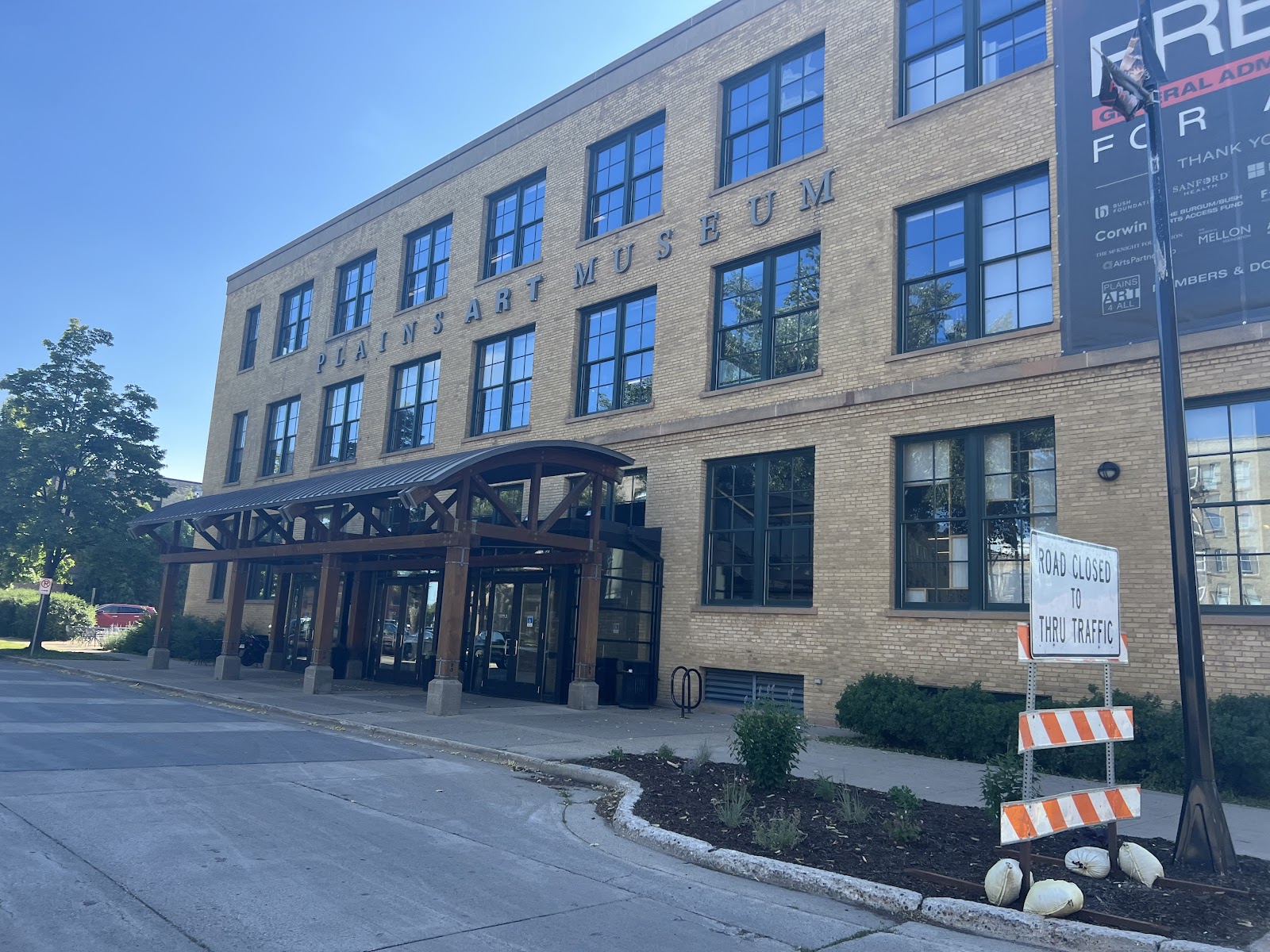
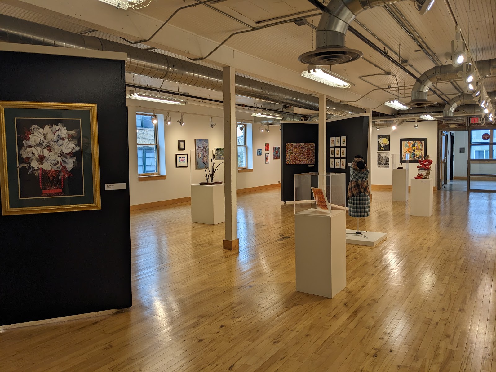
The Plains Art Museum occupies a converted early twentieth-century warehouse in downtown Fargo, North Dakota, combining retained industrial fabric — brick, timber, heavy structure — with the white-walled gallery interiors that displaying art requires.
That produces the sharpest version of a condition several venues in this series share: two registers in one building, and here they are further apart than usual. Original brick is a warm textured mid-tone that reads best in raking light and gives a frame character for nothing. Gallery white is a cool neutral surface designed to disappear behind whatever hangs on it, and it supplies no character at all. They do not blend frame by frame.
The building’s logic is therefore about choosing, and about knowing which spaces do which. We have not photographed a wedding at the Plains Art Museum; converted warehouses and white galleries behave the same wherever they meet. Which spaces host events and what the collection photography rules are are questions for their events team — the second constrains the plan more than the architecture does.
The Plains Art Museum at a glance
| Where | Downtown Fargo, North Dakota |
| Character | A converted warehouse with original brick and white gallery interiors |
| Two registers | Warm textured brick, and cool neutral gallery white |
| The decision | Pick one as the spine and use the other deliberately |
| Ask first | Collection rules on flash, tripods and publication |
The two registers, and why brick should usually lead
Brick is warm, textured and high in micro-contrast; gallery white is cool, smooth and deliberately flat. Placed next to each other in a sequence the brick reads as orange and the white reads as grey, and a set that alternates frame by frame looks uncertain rather than varied. Grading cannot reconcile them, because the warmth of one and the neutrality of the other are what each surface is.
Brick is usually the better spine, and for a specific reason: it is what the building is. A white gallery in Fargo looks like a white gallery anywhere, whereas a converted warehouse with original structure does not. If the gallery is going to say where it was taken, the brick says it.
Brick also behaves well. It is a mid-tone that holds detail at almost any sensible exposure, unlike white walls that clip or dark panels that block, and its texture means a frame never feels empty. It reflects strongly warm, so set a custom white balance for the faces rather than the wall. And it needs raking light — light running along a brick elevation lifts every mortar line, while light pointed at it flattens the whole thing into a brown field.
The white galleries then do what they genuinely do better: the dress, the rings, the stationery, and anything that benefits from a clean uncluttered background. Those frames read as a deliberate change of pace rather than as inconsistency, particularly if they are shot at a different point in the day rather than interleaved.
Working the white galleries when you are in them
A white gallery gives no separation between a subject and a background, which is the opposite problem from brick. Four tools fix it and all have to be brought deliberately. A long lens at a wide aperture so the wall goes soft and the subject is the only sharp thing. One directional source from the side to create a shadow side and an edge. Framing against a darker element — a doorway, a shaded corner, an open gallery beyond. And negative fill: something dark on the shadow side, which subtracts light where the room insists on adding it.
Negative fill is the least used and the most effective. In an evenly lit white room, subtracting light manufactures the contrast the architecture refuses to provide, and it costs nothing but a dark panel or a well-chosen position.
A white gallery is also the best possible surface for coloured light, which is a genuine advantage hiding inside the problem. Neutral walls render a gel accurately rather than muddying it, so a warm key on the couple against a cool wash on the wall gives colour separation where tonal separation is impossible.
Artworks are assertive backgrounds and need the standard decision: commit deliberately or subordinate with a long lens. Half-in fails. And collection rules should be settled in writing — tripods, flash and sometimes photography are commonly restricted in rooms with loaned works, varying room to room and changing with exhibitions. Ask separately which works may appear in published photographs.
- Make brick the spine; it is what the building is
- Custom white balance for faces, not for brick
- Light along brick, not at it, so the mortar lines read
- In white galleries use negative fill and a long lens
- Settle collection rules in writing, and ask about publication separately
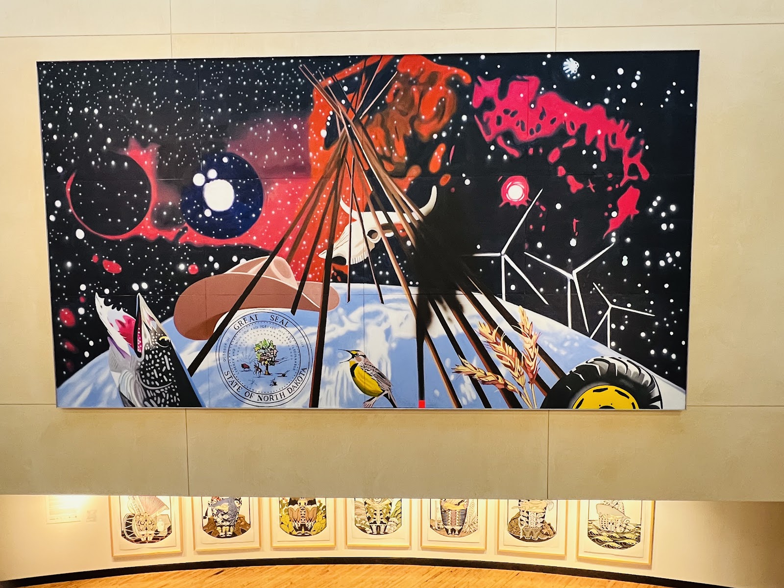
The structure, the windows, and a Dakota winter
Warehouse structure — heavy timber posts, beams, steel — is a compositional asset in the way a colonnade is: repetition, line and rhythm. It rewards precise framing, because in a spare converted volume a crooked horizontal is obvious with nothing else in the frame to distract from it. Level deliberately.
Window openings are the other retained feature and they are generous, because a warehouse built before reliable electric light had to be daylit. That means real daylight reaching into the spaces, which is unusual in a museum — and a subject a metre back from a large opening, turned into it, has the best natural light in the building. Steel framing prints a grid of hard shadow in direct sun, which cannot be corrected, so work the shaded side or use the pattern on brick rather than on faces.
Ceilings in a conversion are usually high, dark timber or exposed services, any of which removes the bounce advantage. Check on arrival rather than discovering it when a flash appears to do nothing; a pale gallery wall is often the better bounce surface, which is one situation where the white rooms help.
Original fabric usually takes no fixings, so assume nothing can be taped or clamped and plan a free-standing weighted kit. On timber floors a stand needs real weight.
North Dakota winter shapes the outdoor half severely. Days are very short, so a daylight block belongs early in the afternoon. Cold limits outdoor time to minutes, which is a safety matter in formal clothes. Snow is the best natural fill there is and fools a meter by two stops, so overexpose deliberately. And a camera carried from a heated museum into deep cold and back fogs comprehensively coming in and can take a long time to clear — acclimatise, keep one body outside, and carry extra batteries kept warm, because cold drains them fast.
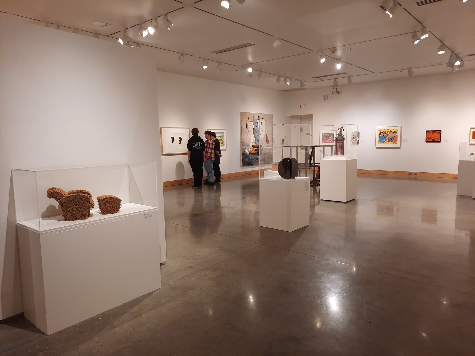
More frames from The Plains Art Museum

The Plains Art Museum wedding photography: common questions
Why do brick and gallery white clash?
Because brick is warm, textured and high in micro-contrast while gallery white is cool, smooth and deliberately flat. Side by side in a sequence the brick reads as orange and the white as grey, and grading cannot reconcile them.
Which should lead?
Brick, usually, because it is what the building is. A white gallery in Fargo looks like one anywhere, whereas a converted warehouse with original structure does not — so if the gallery should say where it was taken, brick says it.
What works in the white galleries?
A long lens wide open for sharpness separation, one directional source for a shadow side, framing against a darker element, and negative fill. Subtracting light is the least used and most effective of the four.
Is a white gallery good for anything?
Coloured light, better than anywhere. Neutral walls render a gel accurately rather than muddying it, so a warm key on the couple against a cool wash behind gives colour separation where tonal separation is impossible.
Does ceiling bounce work?
Often not — converted warehouse ceilings are usually high, dark timber or exposed services. Check on arrival. A pale gallery wall is frequently the better bounce surface, which is one place the white rooms genuinely help.
What does the climate demand?
Short decisive outdoor blocks early in the afternoon, two stops of deliberate overexposure for snow, acclimatising the camera rather than cycling it, and extra batteries kept warm because cold drains them quickly.
More Fargo, ND venue guides
We are writing a photographer’s guide to every venue we would happily shoot in Fargo, ND. Here are three more, plus the full index:
- The Radisson Blu Fargo: How the High Window Frame Is Made
- Rheault Farm: Field Notes on a Preserved Prairie Farmstead
- The Sanctuary Events Center: Four Ways Out of the Stained-Glass Problem
All Fargo, ND Wedding Venues →
Planning a wedding at The Plains Art Museum?
Two registers, one editorial decision, and a climate that shortens the day. Tell us your date and which spaces you have.