 The Sheraton Portsmouth: What a Conventional Hotel Actually Buys You
3S Artspace: Four Ways Out of the White-Box Problem
A gallery is designed so that nothing competes with the art. With no art in it, nothing competes with nothing.
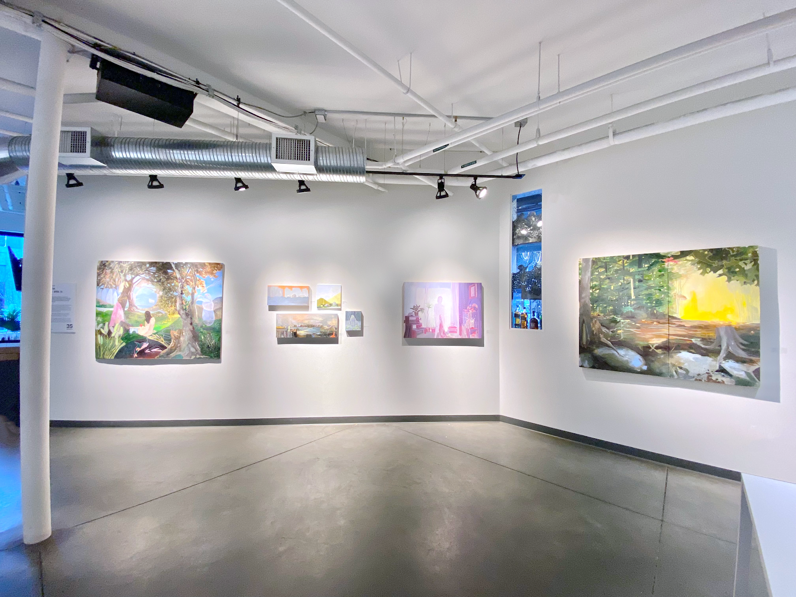
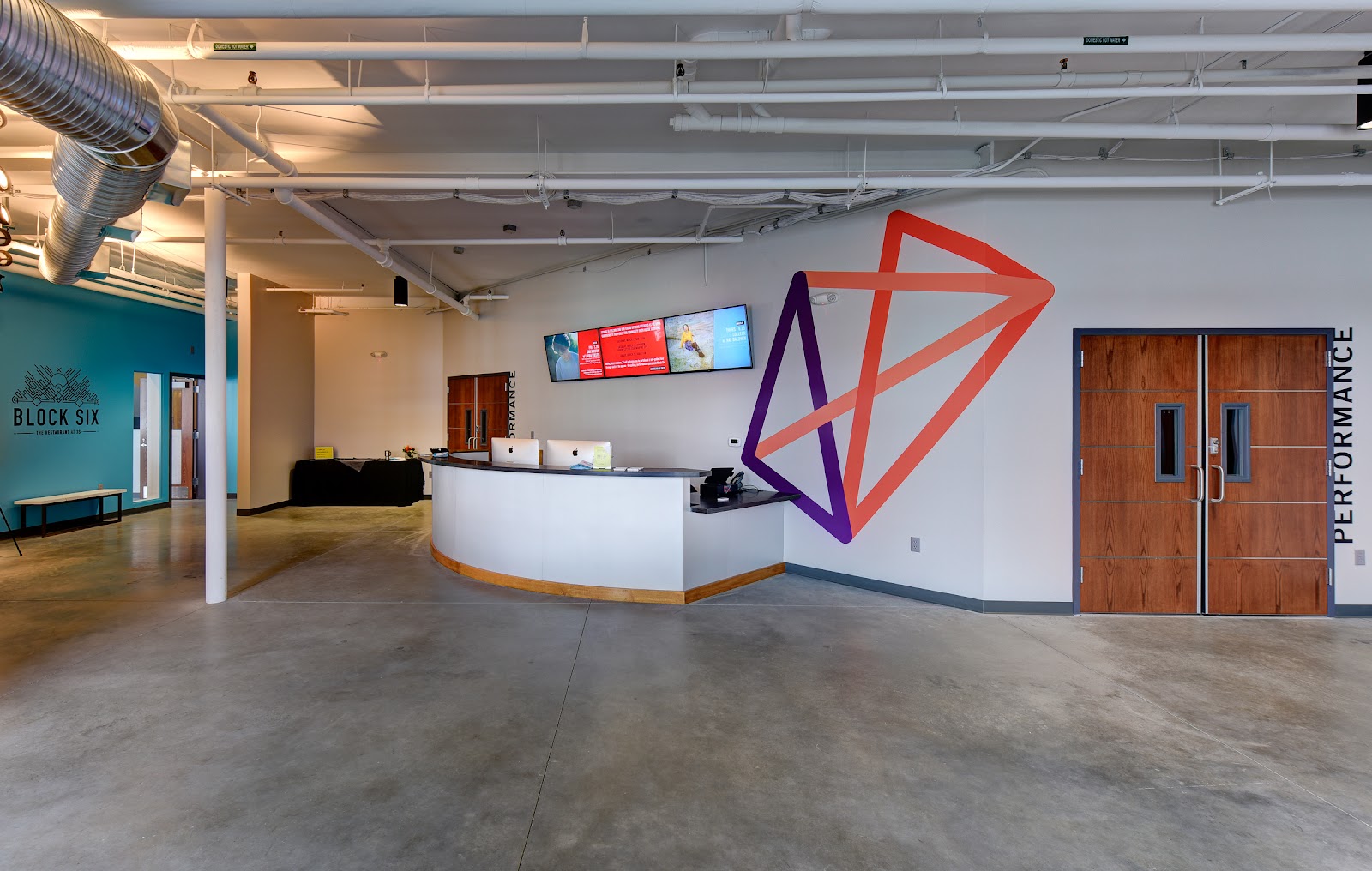
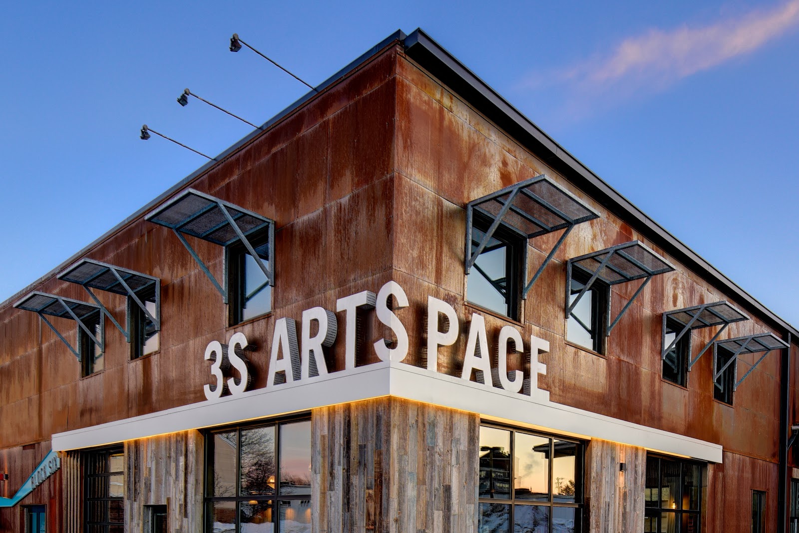
3S Artspace occupies a contemporary building in Portsmouth, New Hampshire, combining a white-walled gallery, a performance space and an outdoor yard, in a register that is deliberately spare rather than decorative.
A gallery interior is a specific photographic problem and it is the opposite of the one most wedding venues present. Historic venues give you too much — pattern, gilding, chandeliers, competing detail — and the work is subtraction. A white box gives you nothing: plain walls, even lighting, no texture, no colour, no architectural incident. The room is designed to disappear behind whatever is hung in it, and at a wedding nothing is hung in it.
That is solvable, and there are four distinct ways to solve it. We have not photographed a wedding at 3S Artspace; white gallery interiors and industrial yards behave the same wherever they occur. Which spaces are available, what may be fixed to the walls and what the yard allows are questions for their events team.
3S Artspace at a glance
| Where | Portsmouth, New Hampshire |
| Character | Contemporary arts venue — white gallery, performance space, outdoor yard |
| The problem | A room designed to disappear, with nothing in it to disappear behind |
| Consequence | No texture, no colour, no incident; the photographer supplies all of it |
| Ask first | What may be attached to the walls, and what the yard permits |
Why an empty white room is hard
Three things are missing and each one is normally doing work. There is no texture, so the walls give a flat featureless field rather than a surface. There is no colour, so nothing separates a pale dress from a pale background. And there is no architectural incident — no moulding, no window reveal, no beam — so there is nothing to frame with, lead the eye with, or place a subject against.
Gallery lighting compounds it. Galleries are lit evenly and from above so that works hang without hot spots, which is exactly the wrong condition for faces: even light gives no modelling, and overhead light shadows the eye sockets and marks under the nose and chin.
The result is a frame that is technically perfect and visually inert: correctly exposed, sharp, and saying nothing. Photographers often blame themselves or the venue; the honest diagnosis is that the room was built to be neutral and it is succeeding.
The four responses all involve introducing something the room refuses to provide — shadow, colour, geometry or people at density.
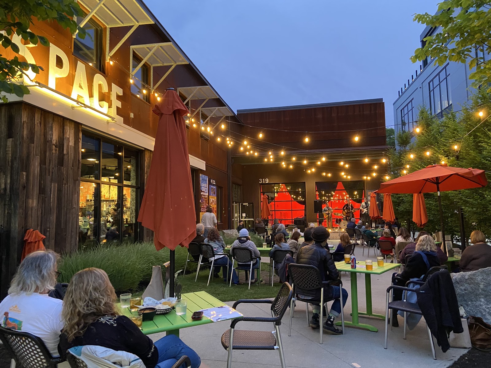
Ways one and two: make shadow, and make geometry
The first response is to light hard and from the side, which is the opposite of what the room does. A single bare or gridded source at ninety degrees to the camera across a white wall produces a sharp shadow edge on a face and a gradient across the wall behind — and suddenly the frame has direction, form and a graphic quality. In a textured period room that hardness would fight the decor; in a white box it is the only thing supplying form.
Negative fill is the free version. Putting something dark on the shadow side of a subject — a dark panel, a coat, standing them beside an open doorway into a dark room — subtracts light where the gallery insists on adding it, and manufactures the contrast the space refuses. In an evenly lit white room, subtracting is more effective than adding and almost nobody does it.
The second response is to build geometry out of the architecture that does exist. A white box usually has doorways, corners, columns, a floor line and a ceiling line, and those are enough if the camera is precise. Place a subject exactly within a doorway, or exactly on the axis of a corner, and the frame acquires structure. What fails is approximate placement — with nothing else in the frame, a subject slightly off a line reads as a mistake rather than a choice.
Hard shadows on a white wall are themselves geometry. A single source casting a defined shadow of a figure onto a blank wall is a composition in two elements, and it only exists in a room this plain.
- Light hard and from the side; the room supplies no form of its own
- Use negative fill — subtracting beats adding in an evenly lit white space
- Place subjects exactly on a line or in a doorway; approximate reads as error
- Treat a cast shadow on a blank wall as a compositional element
- Fill the frame with people when the room has nothing to offer
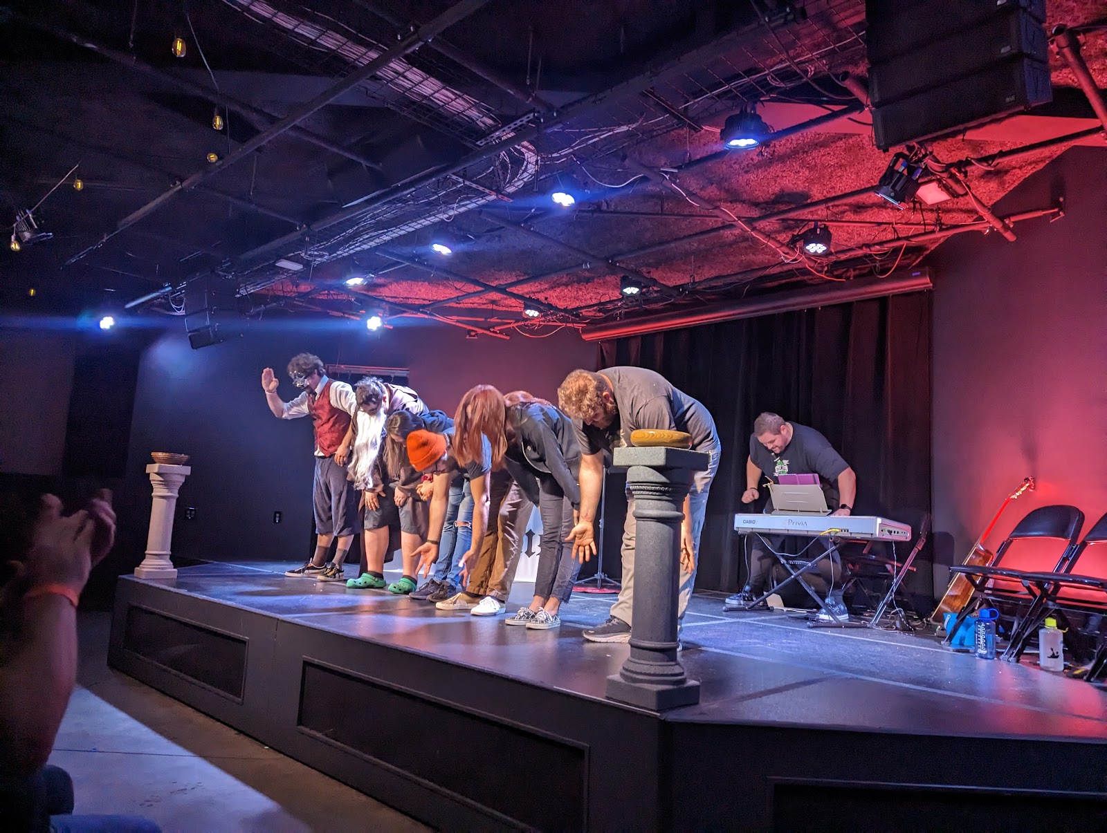
Ways three and four: add colour, or fill it with people
The third response is to introduce colour, because the room has none. A single gelled source — deep blue, amber, magenta — across a white wall gives the entire frame a colour identity that the space does not possess, and because the walls are neutral they render the gel accurately rather than muddying it. A white gallery is actually the best possible surface for coloured light, which is a genuine advantage hiding inside the problem.
Two gels at once is the version worth carrying: a warm key on the couple and a cool wash on the wall behind, or the reverse. That gives colour separation between subject and background where tonal separation is impossible, and it looks deliberate rather than corrective.
The fourth response is density. A plain room photographs badly when it is empty and well when it is full, because people supply the texture, colour and incident the architecture lacks. Frames packed with guests — a crowded dance floor, a group mid-toast, a room at capacity — read correctly in a gallery space in a way they would not in an ornate one, where they would compete with the decor. So the reception is the easy part of the day here and the empty-room portraits are the hard part.
The yard outside is the counterweight and it should be used deliberately. An outdoor industrial space gives brick or concrete, weather, sky, and directional daylight — everything the gallery removes. Even in flat light, an exterior wall with real texture is a better background than a perfect white one, and the last ninety minutes give raking light that a gallery cannot produce at any hour.
One practical note: because the interior is time-independent and weatherproof, it is the right block to move when the running order slips. Everything that depends on the sun is outside.
What works in your favour
- Neutral walls render coloured light accurately — the best surface for gels
- Hard side light and cast shadows become compositions in themselves
- Rooms full of people photograph well, so the reception is the easy part
- An outdoor yard supplying the texture and direction the gallery lacks
- Entirely weatherproof and time-independent interiors
What to plan around
- No texture, colour or architectural incident to work with
- Even overhead gallery lighting gives no modelling and shadows the eyes
- A pale dress against a white wall has no separation at all
- Empty-room portraits are the hardest frames of the day
- Approximate placement is glaring when nothing else is in the frame
More frames from 3S Artspace
3S Artspace wedding photography: common questions
Why are photographs in a white gallery so flat?
Because the room is built to be neutral and it succeeds. No texture, no colour, no architectural incident, and even overhead lighting designed so hung works have no hot spots — which is precisely the wrong condition for faces.
What is the most effective fix?
Hard side light. A single bare or gridded source at ninety degrees across a white wall gives a sharp shadow edge on the face and a gradient behind. In a plain room that hardness is the only thing supplying form.
What is the free fix?
Negative fill — something dark on the shadow side of the subject, whether a panel, a coat, or an open doorway into a dark room. In an evenly lit white space, subtracting light is more effective than adding it, and almost nobody does it.
Is a white gallery good for anything?
Coloured light, better than anywhere. Neutral walls render a gel accurately instead of muddying it, so a warm key on the couple against a cool wash on the wall gives colour separation where tonal separation is impossible.
When does the room photograph well?
When it is full. People supply the texture, colour and incident the architecture lacks, and a packed dance floor reads correctly in a gallery in a way it would not in an ornate room. The reception is the easy part; empty-room portraits are the hard part.
What should the yard be used for?
Everything the gallery removes — texture, weather, sky and directional daylight. Even in flat light a real textured exterior wall beats a perfect white one, and the last ninety minutes give raking light no gallery can produce.
More New Hampshire venue guides
We are writing a photographer’s guide to every venue we would happily shoot in New Hampshire. Here are three more, plus the full index:
- The AC Hotel Portsmouth: One Decision About Which Way You Face
- Discover Portsmouth Center: Field Notes on a Small Museum Venue
- The Hotel Portsmouth: Working a Venue at Domestic Scale
Planning a wedding at 3S Artspace?
A white box needs shadow, colour or a crowd. Tell us your date and we will bring the first two.