 Hotel Saint Louis: A Walk-Through of an 1893 Union Trust Building
The Muehlebach Hotel: A Historic Wing Attached to a Modern One
A 1915 wing joined to a modern tower is two venues at one address, and they should not be mixed frame by frame.
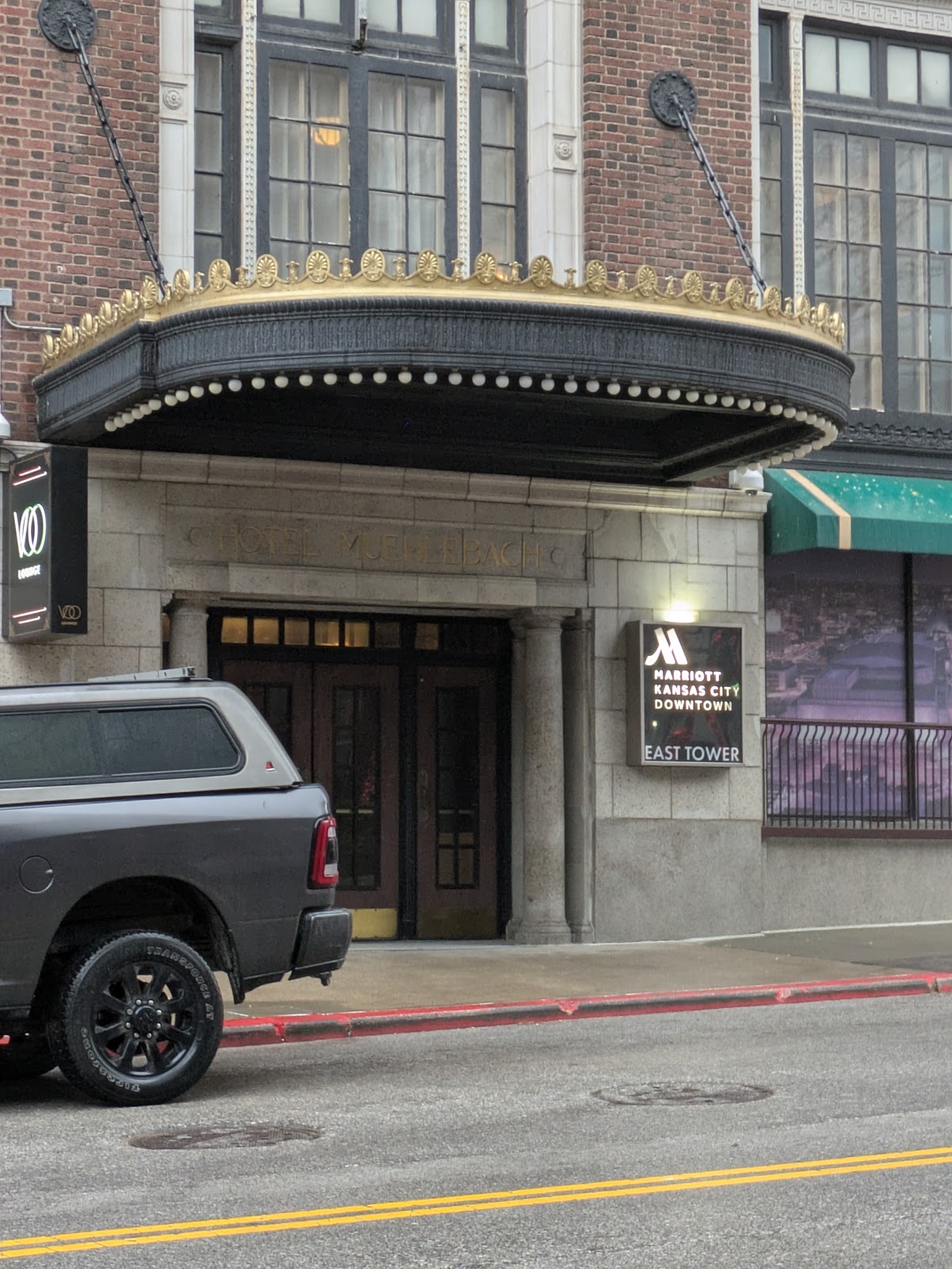
The Muehlebach Hotel opened in 1915 in downtown Kansas City, Missouri, and was later joined to a modern tower to form a single hotel — so the property now contains a period wing with historic ballrooms and a contemporary wing with current guest floors and function space.
This arrangement is common in older American hotels and it produces a specific photographic situation. The two wings are not variations on a theme; they are different buildings connected by a corridor. The 1915 wing is warm, ornate, textured and dim, with plasterwork and panelling. The modern wing is cool, plain, evenly lit and bright, with clean surfaces and a neutral palette. Each photographs well on its own terms and a sequence that alternates between them frame by frame looks like coverage of two weddings.
So the decision is editorial and it should be made before the day. This is an honest account of which briefs each wing suits. We have not photographed a wedding at the Muehlebach; period wings joined to modern towers behave the same wherever the arrangement exists. Which rooms are in which wing is the first question for their events team, and it is more useful than any other.
The Muehlebach Hotel at a glance
| Where | Downtown Kansas City, Missouri |
| Character | A 1915 hotel joined to a later modern tower |
| The situation | Two buildings at one address, connected by a corridor |
| 1915 wing | Warm, ornate, textured, dim — plasterwork and panelling |
| Ask first | Which allocated rooms are in which wing |
Why the two wings do not mix
The clash is measurable rather than a matter of taste. A 1915 interior is lit warm — tungsten, or LED chosen to imitate it — and it is high in visual contrast, because plasterwork, dark wood and deep colour create strong tonal separation. A modern interior is lit cooler and is low in contrast, because pale surfaces and even lighting flatten the tonal range deliberately.
Put a warm high-contrast frame next to a cool low-contrast one in a sequence and both look wrong: the period one reads as orange, the modern one as grey. Neither photograph is at fault; the pairing is. And because a wedding gallery is consumed as a sequence rather than as single images, the pairing is what the couple actually experiences.
Grading cannot reconcile them. Cooling the period wing drains its character and warming the modern wing makes it look strange, because the warmth of one and the coolness of the other are what each building is. Removing both leaves nothing.
So pick a spine. The period wing is usually the stronger choice, because it is what nowhere else has — a contemporary hotel interior in Kansas City looks much like a contemporary hotel interior anywhere, whereas a 1915 ballroom does not. If the gallery is going to say where it was taken, the period wing says it.
Who the period wing suits
Deciding which wing carries the day is the single most useful conversation to have before the date, because it is a choice between two coherent outcomes rather than a compromise between them. Both wings are good. They are simply not the same venue, and a gallery that commits to one reads as deliberate where a gallery that samples both reads as inconsistent.
The 1915 register fits a clear set of intentions:
- Couples who want warmth, ornament and period gravitas rather than brightness and air
- Anyone drawn to plasterwork, panelling and the texture of a century-old interior
- Autumn and winter weddings, where a warm dim interior suits the season
- Couples happy for the photographer to bring lights, because the rooms require them
- Briefs where the venue should be identifiable in the photographs
Who the modern wing suits better
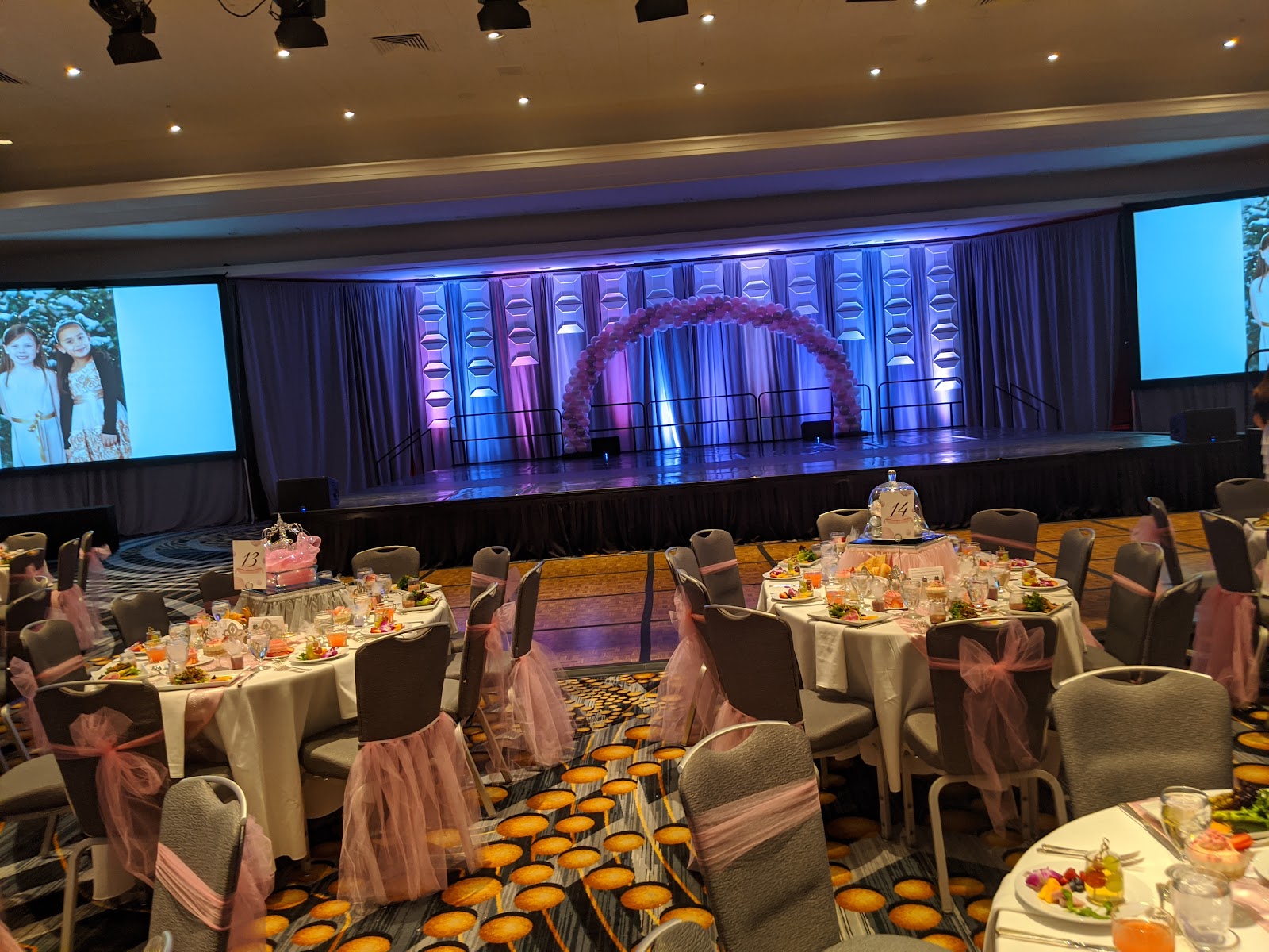
That said, the modern wing is not the lesser option — it is the right answer for a different brief, and saying so is more honest than treating it as a fallback. Some of what a couple most wants is available there and genuinely not available in the period rooms.
And the contemporary wing is the right answer for other briefs entirely:
- Couples whose references are bright, pale and airy — achievable there and not in the period wing
- Preparation coverage, dress and detail work, where clean uncluttered backgrounds help
- Anyone wanting reliable daylight, since modern guest floors have larger windows
- Briefs needing a light-and-neutral edit that warm plasterwork would disrupt
- Larger function requirements, where modern rooms are usually more flexible
Working each wing, and sequencing them
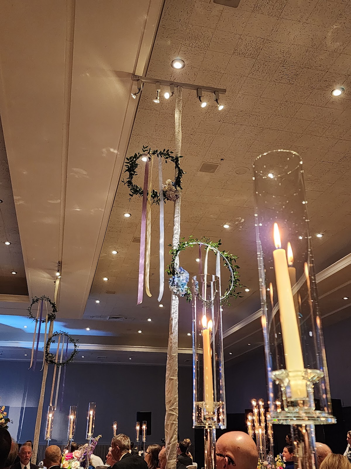
The period wing needs light brought in. Panelling and deep colour absorb, so the ambient is low, the fall-off is steep, and a flash aimed at a timber ceiling returns almost nothing — bounce, the reflex move indoors, barely functions. Light directly with a warm-gelled source, place people near any windows, and let the wood read as warm wood rather than correcting it to grey. Ornate plaster sits stops above the people beneath it, so raise the couple towards the ceiling rather than exposing down to them, within two or three stops rather than level.
The modern wing needs contrast brought in. Even lighting and pale surfaces give almost no separation between a subject and a background, so the tools are a long lens at a wide aperture for sharpness separation, one directional source to create a shadow side, framing against a darker element, and negative fill — something dark on the shadow side, which subtracts light where the room insists on adding it. Subtracting is more useful than adding in a pale room, and almost nobody does it.
For sequencing, split by time rather than interleaving. Preparation and detail work in the modern wing in the morning, where the windows are larger and the backgrounds are clean; then everything else in the period wing. That way the contrast lands where the day naturally changes and the sequence gains structure rather than looking uncertain.
The connecting corridors deserve one note: they are usually the least interesting part of a joined hotel and they are where the two registers meet most awkwardly. Treat them as transit rather than as location, and do not build a frame in one unless it has something genuinely worth having.
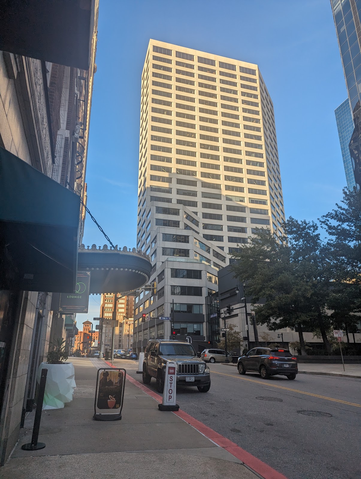
Outside, downtown Kansas City gives 1910s and 1920s commercial architecture — the same vocabulary as the period wing, which makes it a coherent extension of it rather than a third register. Parts of downtown are low-rise, so low evening sun reaches street level and runs the length of a street, and that is the block with a clock attached because both wings are time-independent. Missouri summer humidity fogs a lens carried from air conditioning for ten to twenty minutes, so acclimatise before the outdoor block.
A final point about the joined-hotel arrangement itself, which is a real practical advantage rather than only a complication. Having two registers under one roof means a change of look costs a walk rather than a car journey, so a gallery can carry both a bright morning and a warm evening without anybody being transported anywhere. The discipline required is only that the change happens once, at a point in the day that explains it.
More frames from The Muehlebach Hotel
The Muehlebach Hotel wedding photography: common questions
Why do the two wings clash?
Because a 1915 interior is warm and high in contrast while a modern one is cooler and low in contrast. Placed next to each other in a sequence the period frame reads as orange and the modern one as grey — the pairing is at fault, not either image.
Can grading fix it?
No. Cooling the period wing drains its character and warming the modern wing makes it look strange, because the warmth of one and the coolness of the other are what each building is. Removing both leaves nothing.
Which wing should lead?
Usually the period one, because it is what nowhere else has. A contemporary hotel interior in Kansas City looks like one anywhere; a 1915 ballroom does not. If the gallery should say where it was taken, the period wing says it.
What does the period wing need?
Light brought in. Panelling and deep colour absorb, so bounce barely functions — light directly with a warm-gelled source, work near windows, and raise the couple towards ornate plaster rather than exposing down to them.
What does the modern wing need?
Contrast brought in. Even lighting and pale surfaces give no separation, so use a long lens wide open, one directional source, framing against a darker element, and negative fill — something dark on the shadow side.
How do you sequence them?
Split by time rather than interleaving. Preparation and detail work in the modern wing in the morning, then everything else in the period wing, so the contrast lands where the day naturally changes.
More Kansas City, MO venue guides
We are writing a photographer’s guide to every venue we would happily shoot in Kansas City, MO. Here are three more, plus the full index:
- The Aladdin Hotel: What a 1925 Art Deco Interior Suits
- The Crossroads Hotel: Reading a Warehouse Conversion Through the Day
- The Fontaine Hotel: One Decision About the Rooftop Pool
All Kansas City, MO Wedding Venues →
Planning a wedding at The Muehlebach Hotel?
Two wings, one editorial decision. Tell us which rooms you have and we will pick the spine.