 The Venue, Asheville: A Season-by-Season Guide
Marbles Kids Museum: Four Ways Out of the Bright-Colour Problem
Every surface in a children’s museum is a strong colour on purpose. That is four problems at once.
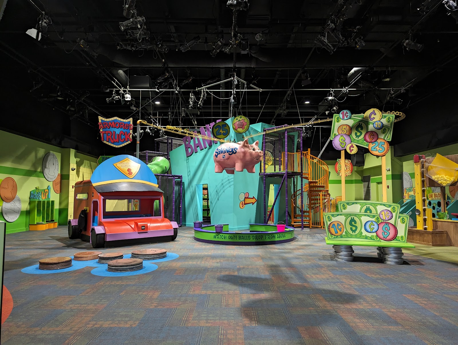
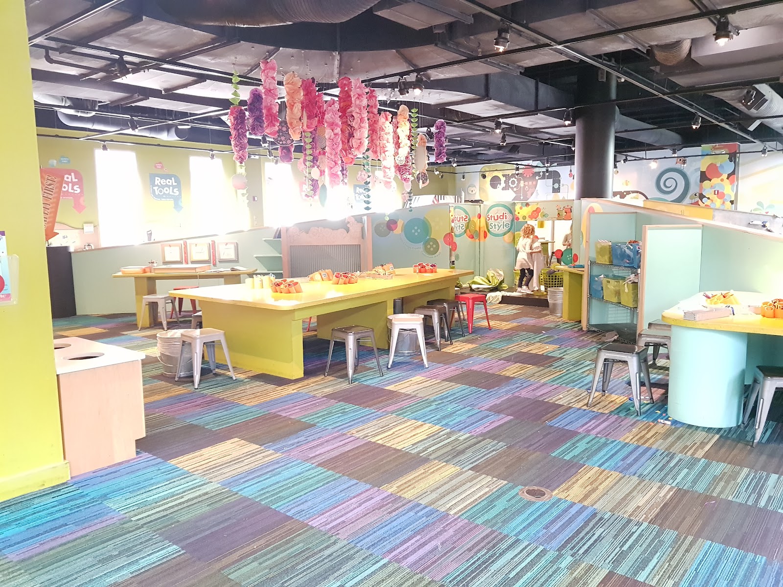
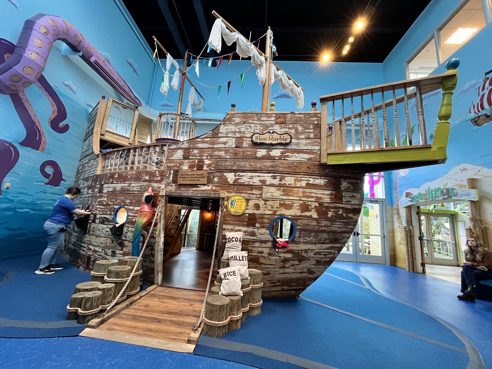
Marbles Kids Museum occupies a building in downtown Raleigh, North Carolina, with large open interiors filled with interactive exhibits designed for children — which means saturated primary colour on almost every surface, at scale.
As a wedding venue it is an unusual choice and a deliberate one, and it is worth being precise about the photographic condition rather than treating it as merely cheerful. Strong colour on every surface does four separate things: it bounces onto skin from multiple directions at once, it competes with the couple for attention, it renders unpredictably because saturated paint and plastics sit near the edge of what a sensor handles cleanly, and it makes a coherent edit difficult because adjacent frames can be dominated by different hues.
There are four ways to work with it and they are all worth having ready. We have not photographed a wedding at Marbles; saturated interactive interiors behave the same wherever they occur. Which spaces host events, whether exhibits can be closed off or lit differently, and what may appear in published photographs are questions for their events team.
Marbles Kids Museum at a glance
| Where | Downtown Raleigh, North Carolina |
| Character | Children’s museum with saturated interactive exhibits at scale |
| The problem | Strong colour on every surface, bouncing from all directions |
| Compounded by | Colour competition, unpredictable rendering, and edit incoherence |
| Ask first | Whether areas can be closed off, and what may be published |
Why saturated surroundings are genuinely difficult
Coloured surfaces behave like gels on very large light sources. A red wall two metres from a face warms and tints it; a blue one cools it; and in a room with several strong colours on different sides, the cast on skin arrives from multiple directions at once and no single correction addresses it. Skin tone becomes unpredictable, which is the fault people notice without being able to name.
Competition is the second problem. Saturated primary colour is visually louder than two people in formal clothes, so at medium distance the eye goes to the exhibit first. The photograph ends up being of a bright room with some people in it.
Rendering is the third and it is technical. Highly saturated paints and plastics, particularly reds and magentas, sit near the limit of what a camera renders accurately, and they commonly clip in one channel while the others are well exposed — which shows as a loss of detail and a slightly plasticky look in exactly the brightest area of the frame. Watching a single luminance histogram will not reveal it; the individual channels will.
Coherence is the fourth. A sequence in which one frame is dominated by yellow and the next by blue does not read as range, it reads as chaos, because a wedding gallery is consumed as a sequence. That is an editorial problem as much as a technical one.

Ways one and two: own the faces, and commit or exclude
The first response is the one that solves most of it: make your own light the only thing illuminating skin. A source at face height, bright enough locally to dominate the coloured bounce, with white balance set to it — and skin becomes consistent frame to frame regardless of what colour is on the wall behind. The colour then reads as deliberate background rather than as a cast you failed to control.
Gel it neutral-to-warm rather than leaving it bare. In a room full of saturated colour an ungelled flash reads as another competing source, whereas a gently warm key sits in the scene and renders skin naturally against whatever is behind.
The second response is compositional and it is the same rule that governs any assertive background: commit or exclude, never half. A saturated exhibit filling a third of the frame behind a couple is a strong, graphic, intentional image. The same exhibit intruding at the edge of an otherwise calm frame is a bright distraction with no purpose. Decide per frame, and when committing, place the couple deliberately within the composition rather than simply in front of the colour.
Excluding is easier than it sounds in a building like this, because open contemporary interiors have plain areas too — structural walls, circulation space, glazing, plain floors. Those are where the quiet frames live, and a gallery needs quiet frames between loud ones.
- Gel a key neutral-to-warm and let it own every face
- Commit to a colour block or exclude it — never half in frame
- Watch individual RGB channels; saturated reds clip before luminance shows it
- Find the plain areas for the quiet frames a loud set needs
- Group frames by dominant colour when editing, not by chronology alone
Ways three and four: expose for the channel, and edit in blocks
The third response is technical and specific. Because saturated colours clip in one channel first, the exposure has to be set with the channels in mind rather than the overall brightness. In practice that means pulling exposure down slightly whenever a strong red or magenta occupies a significant part of the frame, and checking the RGB histogram rather than the combined one. A red that has clipped is unrecoverable and it looks like a flat plastic shape; a red held just below clipping retains texture and reads as a surface.
Shooting raw matters more here than in a neutral venue for the same reason: the latitude to pull a single channel back is the difference between a usable frame and a lost one.
The fourth response is editorial. Rather than fighting the colour variety, organise the set so that colour changes deliberately — a run of frames in one dominant hue, then a plain transitional frame, then a run in another. That reads as intentional structure. Interleaving hues frame by frame reads as noise. It costs nothing at capture and it is decided at the edit, but knowing it in advance changes what you shoot: it means gathering several frames in each colour area rather than one of each.
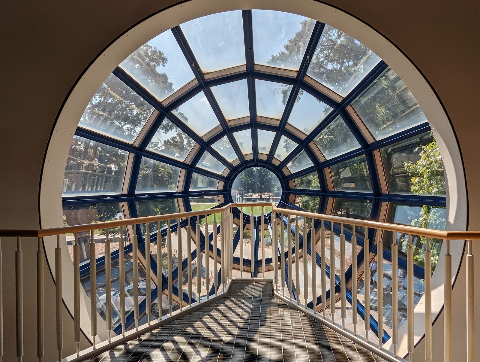
Beyond the exhibits, the building’s contemporary architecture gives the plain register. Open interiors, glazing and structural elements provide clean uncluttered backgrounds and, at the windows, the best light in the building — a large window facing away from the sun is a big soft neutral source with none of the colour problems the interior has.
And downtown Raleigh is immediately outside: brick frontages, period buildings and a compact walkable centre, low-rise enough in parts that low evening sun reaches street level and runs along a street. That is the counterweight the gallery needs, because a set shot entirely among saturated exhibits is exhausting. A block outside in the last ninety minutes fixes it.
More frames from Marbles Kids Museum
Marbles Kids Museum wedding photography: common questions
Why does skin tone go wrong in a brightly coloured venue?
Because coloured surfaces act like gels on very large sources. A red wall two metres away warms and tints a face, a blue one cools it, and with several strong colours on different sides the cast arrives from multiple directions at once so no single correction fixes it.
What is the most reliable fix?
Let your own light own the faces. A gently warm-gelled source at face height, bright enough to dominate the coloured bounce, with white balance set to it. Skin is then consistent regardless of what colour is behind, and the colour becomes deliberate background.
Should the exhibits be in frame?
Fully or not at all. A saturated exhibit filling a third of the frame behind a couple is a strong graphic image; the same exhibit intruding at the edge of a calm frame is a bright distraction with no purpose. Decide per frame.
Is there a technical trap?
Yes — saturated reds and magentas clip in one channel before the overall luminance suggests any problem, and a clipped red is unrecoverable and looks like flat plastic. Watch the RGB histogram rather than the combined one, and shoot raw.
How do you keep the edit coherent?
Group by colour rather than purely by chronology — a run of frames in one dominant hue, a plain transitional frame, then a run in another. That reads as structure; interleaving hues frame by frame reads as noise. It means gathering several frames per colour area.
What does the gallery need that the exhibits cannot give?
Quiet. A set shot entirely among saturated colour is exhausting, so the building’s plain areas and glazing supply the calm frames, and a block outside in downtown Raleigh in the last ninety minutes supplies the counterweight.
More North Carolina venue guides
We are writing a photographer’s guide to every venue we would happily shoot in North Carolina. Here are three more, plus the full index:
- The Merrimon-Wynne House: Reading an 1876 House Through the Day
- The North Carolina Museum of Art: One Decision About Inside or Out
- The North Carolina Museum of History: Field Notes on Exhibit Lighting
Planning a wedding at Marbles Kids Museum?
Saturated colour needs a key, a decision and an RGB histogram. Tell us your date and we will bring all three.